90 KiB
E. Usage And Examples
ContextMenuView Example 01
Summary: A basic context menu that has 3 menu action items (e.g. "Action #1", "Action #2", and "Action #3").
| Notes |
|---|
1️⃣ — The ContextMenuView.menuConfig prop accepts an optional MenuConfig object. This object will be used to create and configure the context menu. |
2️⃣ — You can set the context menu title via passing a string value to the MenuConfig.menuTitle property.📝 Note: You can pass an empty string if you don't want a title to appear on top your context menu. |
3️⃣ — To populate the context menu with action items, you can pass a MenuActionConfig object in the MenuConfig.menuItems property.📝 Note A: The MenuConfig.menuItems property can accept an array of a MenuElementConfig union type.To be more specific, the menuItems property can accept an array containing any of the following object types: MenuConfig object, MenuActionConfig, and DeferredMenuElementConfig.📝 Note B: If you pass in a MenuConfig object in the MenuConfig.menuItems property, it means that you want to create a submenu. See ContextMenuView Example 03 for more details.📝 Note C: If you pass in a DeferredMenuElementConfig object in the MenuConfig.menuItems property, it means that you want to create a deferred menu item (i.e. a menu item that has a loading indicator). See ContextMenuView Example 19 for more details. |
4️⃣ — A MenuActionConfig object represents an action item in the context menu (e.g. copy, paste, delete, etc).As such, if you pass in a MenuActionConfig object to MenuConfig.menuItems, it means that you want to create a context menu action.📝 Note A: The MenuActionConfig.actionKey property serves as a unique identifier for your menu action. If you have multiple menu actions, the actionKey will help you differentiate them.📝 Note B: You will receive the value you passed in MenuActionConfig.actionKey in the ContextMenuView.onPressMenuItem event (i.e. via the nativeEvent object). |
5️⃣ — You can use the ContextMenuView.onPressMenuItem event prop to get notified whenever a menu action item has been selected.The function you pass to the onPressMenuItem prop will receive a OnPressMenuItemEventObject object.📝 Note A: Details about the selected menu action item can be accessed via the OnPressMenuItemEventObject.nativeEvent object.E.g. OnPressMenuItemEventObject``.nativeEvent.actionKey.📝 Note B: If ContextMenuView.shouldWaitForMenuToHideBeforeFiringOnPressMenuItem prop is set to true (which it is by default), then this event will fire after the onMenuDidHide event is triggered. |
// 📝 Note: for the sake of brevity, some of the code is omitted...
import { ContextMenuView } from 'react-native-ios-context-menu';

export function ContextMenuViewExample01(props) {
  return (
    <ContextMenuView
      menuConfig={{
        // Note: If you don't want a menu title to appear for your
        // context menu, you can just pass in an empty string
        menuTitle: 'ContextMenuViewExample01',
        menuItems: [{
          actionKey  : 'key-01',
          actionTitle: 'Action #1',
        }, {
          actionKey  : 'key-02'   ,
          actionTitle: 'Action #2',
        }, {
          actionKey  : 'key-03'   ,
          actionTitle: 'Action #3',
        }],
      }}
      onPressMenuItem={({nativeEvent}) => {
        Alert.alert(
          'onPressMenuItem Event',
          `actionKey: ${nativeEvent.actionKey} - actionTitle: ${nativeEvent.actionTitle}`
        );
      }}
    >
      {/** Components */}
    </ContextMenuView>
  );
};


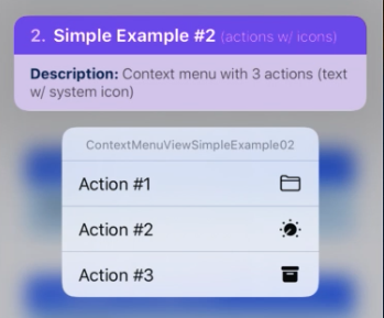
ContextMenuView Example 02
Summary: Icon Example — This examples shows how to add a system icon in the context menu action.
| Notes |
|---|
1️⃣ — A menu action (i.e. MenuActionConfig object) can be configured to show an icon via its MenuActionConfig.icon property.📝 Note A: The icon property accepts a ImageItemConfig object.📝 Note B: A ImageItemConfig object is used to describe images/assets (e.g. SF Symbols icons, images, xcasset images, programmatic images, etc). |
| 2️⃣ — In this example, we want to use a "SF Symbols" icon for the menu action. In order to do this, the ImageItemConfig.type property must be set to "IMAGE_SYSTEM".📝 Note A: Passing in a value of "IMAGE_SYSTEM" to the type property means that we want to create a "SF Symbols" system icon.📝 Note B: Using a "SF Symbols" icon requires iOS 13+. 📝 Note C: Via the ImageItemConfig object, you can also configure the context menu action to use other icons (e.g. xcasset items, images, gradients, solid colors, etc).📝 Note D: You can apply a tint to the icon via the ImageItemConfig.imageOptions property using the UIImageConfig.tint and UIImageConfig.renderingMode property. See ContextMenuView Example 17 for more details. |
3️⃣ — In order to configure what kind of "SF Symbols" icon we want to use for the menu action, we need to pass in a ImageSystemConfig object to the ImageItemConfig.imageValue property.We can set what kind of icon to use via passing a string value to the ImageSystemConfig.systemName property.📝 Note A: An ImageSystemConfig object is used to generate a "SF Symbols" image. Using this configuration object, we can optionally customize the "SF Symbols" icon further via the following properties: pointSize, weight, scale, hierarchicalColor, paletteColors, etc.📝 Note B: The string value passed to the ImageSystemConfig.systemName property must be a valid SF Symbols name.📝 Note C: To view the list of SF Symbols icons (along with their corresponding icon names), you'll need to download the SF Symbols Mac app from this page. |
// 📝 Note: for the sake of brevity, some of the code is omitted...
import { ContextMenuView } from 'react-native-ios-context-menu';

export function ContextMenuViewExample02(props) {
  return (
    <ContextMenuView
      menuConfig={{
        menuTitle: 'ContextMenuViewExample02',
        menuItems: [{
          actionKey  : 'key-01',
          actionTitle: 'Action #1',
          icon: {
            type: 'IMAGE_SYSTEM',
            imageValue: {
              systemName: 'folder',
            },
          }
        }, {
          actionKey  : 'key-02'   ,
          actionTitle: 'Action #2',
          icon: {
            type: 'IMAGE_SYSTEM',
            imageValue: {
              systemName: 'dial.fill',
            },
          }
        }, {
          actionKey  : 'key-03'   ,
          actionTitle: 'Action #3',
          icon: {
            type: 'IMAGE_SYSTEM',
            imageValue: {
              systemName: 'archivebox.fill',
            },
          }
        }],
      }}
    >
      {/** Components */}
    </ContextMenuView>
  );
};
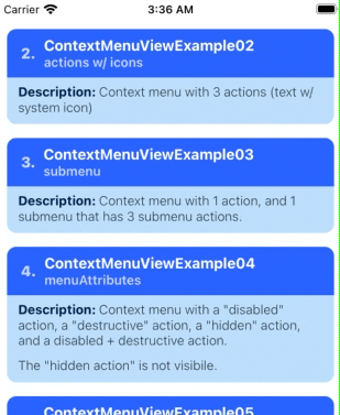
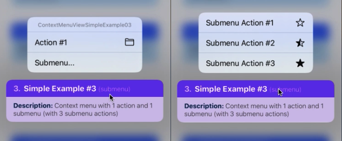
ContextMenuView Example 03
Summary: Nested Menu — This example shows a context menu that has a submenu item inside its list of menu actions.
| Notes |
|---|
| 1️⃣ — A context menu supports having nested menu's (i.e. submenu's). A submenu is basically just another menu with it's own separate list of menu actions. Tapping it will show another context menu (visually this is similar to a dropdown menu). |
2️⃣ — As mentioned in the earlier examples, the MenuConfig.menuItems property can accept a MenuActionConfig object, or a MenuConfig object.Passing in a MenuActionConfig object to MenuConfig.menuItems makes a menu action, conversely passing in a MenuConfig object will create a submenu item.In other words, to make a submenu, you just need to pass a MenuConfig item in the MenuConfig.menuItems property.📝 Note: You can nest as many submenu's you want (but just remember that having more than 3 nested submenus is considered bad UX). |
 // 📝 Note: for the sake of brevity, some of the code is omitted...
import { ContextMenuView } from 'react-native-ios-context-menu';

export function ContextMenuViewExample03(props) {
  return (
    <ContextMenuView
      menuConfig={{
        menuTitle: 'ContextMenuViewExample03',
        menuItems: [{
          actionKey  : 'key-01',
          actionTitle: 'Action #1',
          icon: {
            type: 'IMAGE_SYSTEM',
            imageValue: {
              systemName: 'folder',
            },
          }
        }, {
          menuTitle: 'Submenu...',
          menuItems: [{
            actionKey  : 'key-01-01',
            actionTitle: 'Submenu Action #1',
            icon: {
              type: 'IMAGE_SYSTEM',
              imageValue: {
                systemName: 'star',
              },
            }
          }, {
            actionKey  : 'key-01-02',
            actionTitle: 'Submenu Action #2',
            icon: {
              type: 'IMAGE_SYSTEM',
              imageValue: {
                systemName: 'star.lefthalf.fill',
              },
            }
          }, {
            actionKey  : 'key-01-03',
            actionTitle: 'Submenu Action #3',
            icon: {
              type: 'IMAGE_SYSTEM',
              imageValue: {
                systemName: 'star.fill',
              },
            }
          }]
        }],
      }}
    >
      {/** Components */}
    </ContextMenuView>
  );
};
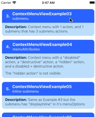
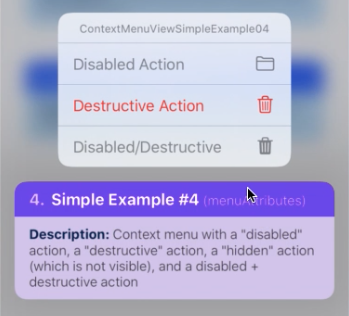
ContextMenuView Example 04
Summary: Menu Attributes — This example context menu showcases the MenuActionConfig.menuAttributes property.
| Notes |
|---|
1️⃣ — The MenuActionConfig.menuAttributes property accepts an array of strings (i.e. an array of MenuAttributes items).In this example, the context menu has 3 actions, each with a different menu attribute assigned to it. The first menu action is a "disabled" action, i.e. it has it's menuAttributes set to ['disabled'], causing the action title text and icon becomes greyed out. |
| 2️⃣ — The second menu action is a destructive action. It has it's menuAttributes set to ['destructive'], causing the action title text and icon becomes red. |
3️⃣ — The third menu action is a "hidden" action. It has it's menuAttributes set to ['hidden'].The menu action is not visible in the menu's list of actions. This is useful for temporarily hiding a menu action item. |
| 4️⃣ — The fourth menu action is a "disabled" + "destructive" action. Visually, it looks very similar to an action that has the ['disabled'] attribute. |
 // 📝 Note: for the sake of brevity, some of the code is omitted...
import { ContextMenuView } from 'react-native-ios-context-menu';

export function ContextMenuViewExample04(props) {
  return (
    <ContextMenuView
      menuConfig={{
        menuTitle: 'ContextMenuViewExample04',
        menuItems: [{
          actionKey     : 'key-01',
          actionTitle   : 'Disabled Action',
          menuAttributes: ['disabled'],
          icon: {
            type: 'IMAGE_SYSTEM',
            imageValue: {
              systemName: 'folder',
            },
          }
        }, {
          actionKey     : 'key-02'   ,
          actionTitle   : 'Destructive Action',
          menuAttributes: ['destructive'],
          icon: {
            type: 'IMAGE_SYSTEM',
            imageValue: {
              systemName: 'trash',
            },
          }
        }, {
          actionKey     : 'key-03'   ,
          actionTitle   : 'Hidden Action',
          menuAttributes: ['hidden'],
          icon: {
            type: 'IMAGE_SYSTEM',
            imageValue: {
              systemName: 'trash',
            },
          }
        }, {
          actionKey     : 'key-04'   ,
          actionTitle   : 'Disabled/Destructive',
          menuAttributes: ['disabled', 'destructive'],
          icon: {
            type: 'IMAGE_SYSTEM',
            imageValue: {
              systemName: 'trash.fill',
            },
          }
        }],
      }}
    >
      {/** Components */}
    </ContextMenuView>
  );
};

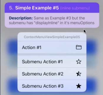
ContextMenuView Example 05
Summary: Nested Menu + Menu Attributes — A context menu that has a in-line submenu.
| Notes |
|---|
You can set the menu options via the MenuConfig.menuOptions property. It accepts an array of UIMenuOptions strings (e.g. 'destructive', 'displayInline').If you pass in ['displayInline'] to menuOptions, the submenu will be added/combined to its parent menu, but with a small separator between them. |
 // 📝 Note: for the sake of brevity, some of the code is omitted...
import { ContextMenuView } from 'react-native-ios-context-menu';

export function ContextMenuViewExample05(props) {
  return (
    <ContextMenuView
      menuConfig={{
        menuTitle: 'ContextMenuViewExample03',
        menuItems: [{
          actionKey  : 'key-01',
          actionTitle: 'Action #1',
          // ...
        }, {
          menuTitle: 'Submenu...',
          // Create an "Inline submenu" by adding `displayInline`
          // in the menu options...
          menuOptions: ['displayInline'],
          menuItems: [{
            actionKey  : 'key-01-01',
            actionTitle: 'Submenu Action #1',
            // ...
          }, {
            actionKey  : 'key-01-02',
            actionTitle: 'Submenu Action #2',
            // ...
          }, {
            actionKey  : 'key-01-03',
            actionTitle: 'Submenu Action #3',
            // ...
          }]
        }],
      }}
    >
      {/** Components */}
    </ContextMenuView>
  );
};
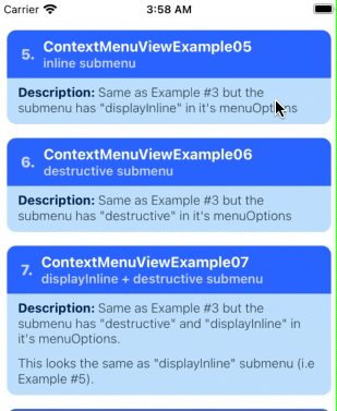
ContextMenuView Example 06
Summary: Menu Options — A context menu that has a destructive submenu.
| Notes |
|---|
You can set the menu options via the MenuConfig.menuOptions property. It accepts an array of UIMenuOptions strings (e.g. destructive, displayInline).If you pass in ['destructive'] to menuOptions, it will tint the submenu to red (but it's menu items won't be affected). |
 // 📝 Note: for the sake of brevity, some of the code is omitted...
import { ContextMenuView } from 'react-native-ios-context-menu';

export function ContextMenuViewExample06(props) {
  return (
    <ContextMenuView
      menuConfig={{
        menuTitle: 'ContextMenuViewExample06',
        menuItems: [{
          actionKey  : 'key-01',
          actionTitle: 'Action #1',
          // ...
        }, {
          menuTitle: 'Submenu...',
          // Create an "destructive" submenu by adding
          // `destructive` in the menu options...
          menuOptions: ['destructive'],
          menuItems: [{
            actionKey  : 'key-01-01',
            actionTitle: 'Submenu Action #1',
            // ...
          }, {
            actionKey  : 'key-01-02',
            actionTitle: 'Submenu Action #2',
            // ...
          }, {
            actionKey  : 'key-01-03',
            actionTitle: 'Submenu Action #3',
            // ...
          }]
        }],
      }}
    >
      {/** Components */}
    </ContextMenuView>
  );
};

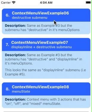
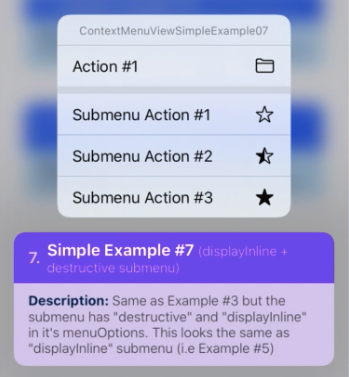
ContextMenuView Example 07
Summary: Menu Options — A context menu that set to be both "destructive" and "display in-line".
| Notes |
|---|
You can set the menu options via the MenuConfig.menuOptions property. It accepts an array of UIMenuOptions strings (e.g. destructive, displayInline).Passing in ['destructive', 'displayInline'] to menuOptions, is functionally the same as passing in ['displayInline']. |
 // 📝 Note: for the sake of brevity, some of the code is omitted...
import { ContextMenuView } from 'react-native-ios-context-menu';

export function ContextMenuViewExample07(props) {
  return (
    <ContextMenuView
      menuConfig={{
        menuTitle: 'ContextMenuViewExample07',
        menuItems: [{
          actionKey  : 'key-01',
          actionTitle: 'Action #1',
          // ...
        }, {
          menuTitle: 'Submenu...',
          // Make the submenu both `'displayInline'` and
          // `'destructive'`.
          //
          // Visually, this is just the same as passing in
          // 'displayInline'.
          menuOptions: ['displayInline', 'destructive'],
          menuItems: [{
            actionKey  : 'key-01-01',
            actionTitle: 'Submenu Action #1',
            // ...
          }, {
            actionKey  : 'key-01-02',
            actionTitle: 'Submenu Action #2',
            // ...
          }, {
            actionKey  : 'key-01-03',
            actionTitle: 'Submenu Action #3',
            // ...
          }]
        }],
      }}
    >
      {/** Components */}
    </ContextMenuView>
  );
};
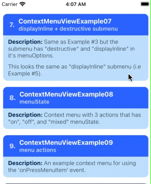
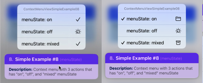
ContextMenuView Example 08
Summary: Menu State — A context menu with 3 actions that has 'on', 'off', and 'mixed' menuState.
| Notes |
|---|
You can set an menu action item's the menu state via the MenuActionConfig.menuState property.📝 Note: On iOS 13, an action item's menu state is indicated via changing it's icon to a checkmark. However on later version of iOS this behavior has been changed to showing a checkmark besides the action title (see gifs/screenshots below). |
 // 📝 Note: for the sake of brevity, some of the code is omitted...
import { ContextMenuView } from 'react-native-ios-context-menu';

export function ContextMenuViewExample08(props) {
  return (
    <ContextMenuView
      menuConfig={{
        menuTitle: 'ContextMenuViewExample08',
        menuItems: [{
          actionKey  : 'key-01',
          actionTitle: 'menuState: on',
          // show a checkmark
          menuState: 'on',
          // ...
        }, {
          actionKey  : 'key-02'   ,
          actionTitle: 'menuState: off',
          // no checkmark
          menuState: 'off',
          // ...
        }, {
          actionKey  : 'key-03'   ,
          actionTitle: 'menuState: mixed',
          // visually this is the same as 'on'
          menuState: 'mixed',
          // ...
        }],
      }}
    >
      {/** Components */}
    </ContextMenuView>
  );
};
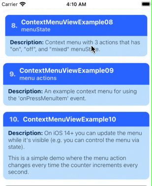
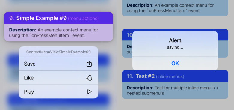
ContextMenuView Example 09
Summary: Events — An example for the onPressMenuItem event prop.
| Notes |
|---|
The onPressMenuItem event prop allows you to know which menu item was pressed via the nativeEvent.actionKey property in the event object.📝 Note A: The entire menu action config (i.e. MenuActionConfig) object of the selected item can be accessed via the nativeEvent object (e.g. nativeEvent.actionTitle, nativeEvent.menuState, etc).📝 Note B: For the full type declaration for all the events, see: MenuEvents.ts. |
 // 📝 Note: for the sake of brevity, some of the code is omitted...
import { ContextMenuView } from 'react-native-ios-context-menu';

export function ContextMenuViewExample09(props) {
  return (
    <ContextMenuView
      menuConfig={{
        menuTitle: 'ContextMenuViewExample09',
        menuItems: [{
          actionKey  : 'save',
          actionTitle: 'Save',
          // ...
        }, {
          actionKey  : 'like',
          actionTitle: 'Like',
          // ...
        }, {
          actionKey  : 'play',
          actionTitle: 'Play',
          // ...
        }],
      }}
      // Use `actionKey` to identify which menu action was
      // pressed....
      onPressMenuItem={({nativeEvent}) => {
        switch (nativeEvent.actionKey) {
          case 'save':
            Alert.alert('saving...');
            break;

          case 'like':
            Alert.alert('liking...');
            break;

          case 'play':
            Alert.alert('playing...');
            break;
        };
      }}
    >
      {/** Components */}
    </ContextMenuView>
  );
};
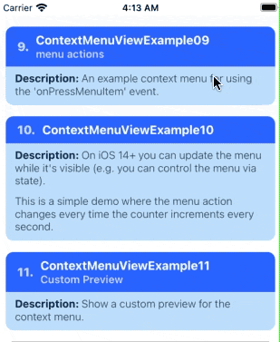
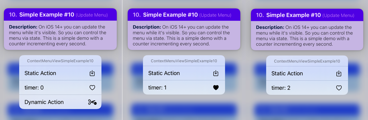
ContextMenuView Example 10
Summary: Dynamic Menu — An example showing how to dynamically update the context menu while it's visible. In this example, the menu action changes every time the counter increments every second.
| Notes |
|---|
| On iOS 14+ you can update the menu while it's visible, e.g. like adding and removing items in the context menu, or changing the action title, etc. You can control the context menu config using state, and dynamically change it as shown in the example below. 📝 Note A: On iOS 13 the context menu will not update while it's visible. 📝 Note B: On iOS 15+, all changes to the context menu config are applied using a fade/crossfade transition. |
 // 📝 Note: for the sake of brevity, some of the code is omitted...
export function ContextMenuViewExample10(props) {
  // `timer` will increment every second...
  const [timer, setTimer] = React.useState(0);

  // ...
  return (
    <ContextMenuView
      // ...
      menuConfig={{
        menuTitle: 'ContextMenuViewExample10',
        menuItems: [{
          actionKey  : 'key-00',
          actionTitle: `Static Action`,
          // ...
        }, {
          actionKey  : 'key-01',
          // update the action title every second...
          actionTitle: `timer: ${timer}`,
          icon: {
            type: 'IMAGE_SYSTEM',
            imageValue: {
               // update the icon every second...
              systemName: ((timer % 2 === 0)
                ? 'heart'
                : 'heart.fill'
              ),
            },
          }
        },
        // this item will be added and removed...
        (timer % 3 === 0) && {
          actionKey  : 'key-02',
          actionTitle: `Dynamic Action`,
          // ...
        }],
      }}
    >
      {/** Components */}
    </ContextMenuView>
  );
};
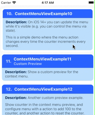
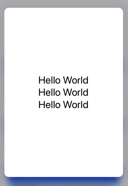
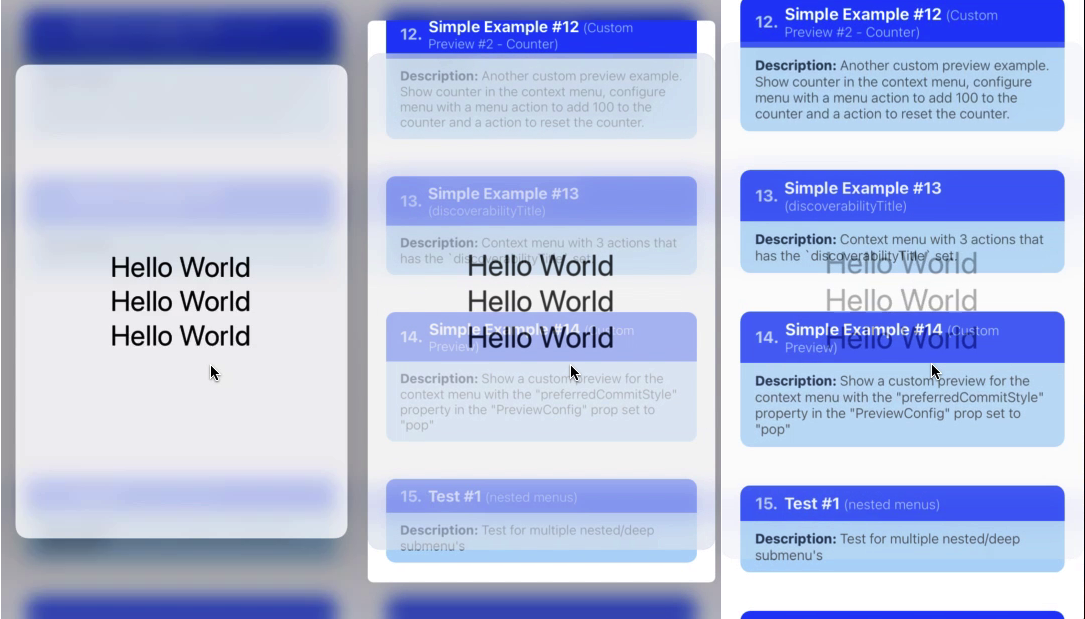
ContextMenuView Example 11
Summary: Context Menu Previews — An example showing how to use a custom preview for the context menu.
| Notes |
|---|
1️⃣ — The ContextMenuView.renderPreview render prop allows you show a custom preview when the context menu appears.📝 Note: The renderPreview prop accepts a function that returns an element. The returned element will be shown inside the context menu preview. |
2️⃣ — The ContextMenuView.previewConfig is used to control the behavior and appearance of the custom context menu preview.In order to show the custom context menu preview, we must first set MenuPreviewConfig.previewType to 'CUSTOM'. By default, this property is set to 'DEFAULT', which means that you do not want to use a custom preview.📝 Note A: The previewConfig prop accepts a MenuPreviewConfig object.📝 Note B: The previewType property accepts a MenuPreviewType string. You can set this to 'DEFAULT' if you want to quickly disable the custom preview. |
3️⃣ — In this example, we want the custom preview to be as big as possible, so we set the MenuPreviewConfig.previewSize property to 'STRETCH'.📝 Note: The previewSize property accepts a MenuPreviewSize string. By default, this prop is set to 'INHERIT', which means to just match the size of the root view returned from renderPreview. |
 // 📝 Note: for the sake of brevity, some of the code is omitted...
import { ContextMenuView } from 'react-native-ios-context-menu';

export function ContextMenuViewExample11(props) {
  return (
    <ContextMenuView
      previewConfig={{
        previewType: 'CUSTOM',
        previewSize: 'STRETCH',
        backgroundColor: 'white'
      }}
      renderPreview={() => (
        <View>
          <Text>
            Hello World
          </Text>
          <Text>
            Hello World
          </Text>
          <Text>
            Hello World
          </Text>
        </View>
      )}
      onPressMenuPreview={() => {
        Alert.alert(
          'onPressMenuPreview Event',
          `Menu preview was pressed...`
        );
      }}
    >
      {/** Components */}
    </ContextMenuView>
  );
};
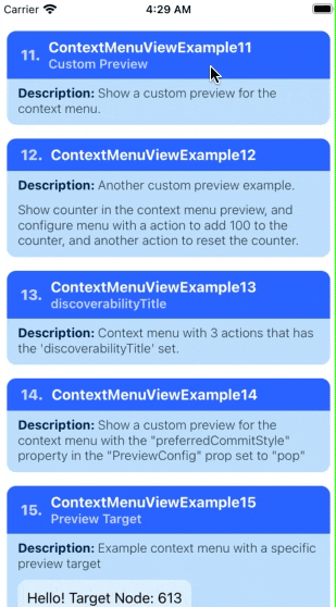
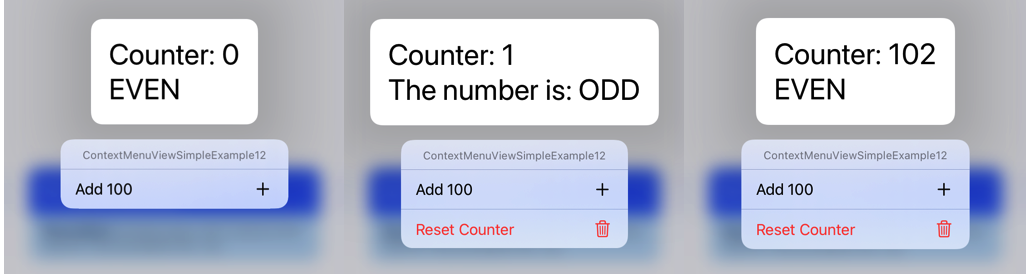
ContextMenuView Example 12
Summary: Context Menu Previews — An example showing a custom context menu preview that dynamically changes its size due to its contents updating every second.
| Notes |
|---|
📝 Note: By default, custom preview will animate to its new size. If you want to disable this behavior, set MenuPreviewConfig.isResizeAnimated property to false. |
 // 📝 Note: for the sake of brevity, some of the code is omitted...

export function ContextMenuViewExample12(props) {
  // increments every second...
  const [timer, setTimer] = React.useState(0);

	// ...
  return (
    <ContextMenuView
      menuConfig={{
        menuTitle: 'ContextMenuViewExample12',
        menuItems: [{
          // ...
        }],
      }}
      previewConfig={{
        previewType: 'CUSTOM',
        backgroundColor: 'white'
      }}
      // The context menu preview grows and shrinks due to the labels/
      // text changing every second...
      renderPreview={() => (
        <View>
          <Text>
            {`Counter: ${timer}`}
          </Text>
          <Text>
            {(timer % 2 === 0)? 'EVEN' : 'The number is: ODD'}
          </Text>
        </View>
      )}
      // ...
    >
      {/** Components */}
    </ContextMenuView>
  );
};
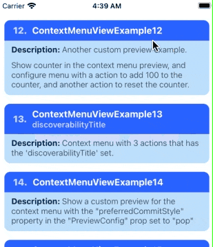
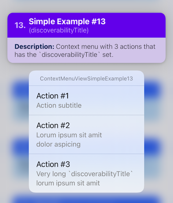
ContextMenuView Example 13
Summary: Menu Action — An example showing how to add a subtitle to menu action.
| Notes |
|---|
You can add a subtitle to a menu action via passing a string value to the MenuActionConfig.actionSubtitle property.📝 Note A: On iOS 13/14, you add subtitles to the menu action via the MenuActionConfig.discoverabilityTitle property, but on iOS 15+ this property is now used for the "discoverability heads-up display" UI.📝 Note B: For backwards compatibility, the string value you passed to discoverabilityTitle will also be used to set actionSubtitle on iOS 15+.To disable this automatic behavior, set the ContextMenuView.shouldUseDiscoverability TitleAsFallbackValueForSubtitle prop to false. |
 // 📝 Note: for the sake of brevity, some of the code is omitted...
import { ContextMenuView } from 'react-native-ios-context-menu';

export function ContextMenuViewExample13(props) {
  return (
    <ContextMenuView
      menuConfig={{
        menuTitle: 'ContextMenuViewExample13',
        menuItems: [{
          actionKey: 'key-01',
          actionTitle: 'Action #1',
          // old way of adding a subtitle...
          // iOS 13 to 14 (still works on iOS 15+)
          discoverabilityTitle: 'Action subtitle',
        }, {
          actionKey: 'key-02'   ,
          actionTitle: 'Action #2',
          // new way of adding a subtitle...
          // iOS 15+ only, but is automatically backwards compatible w/
          // iOS 13/14...
          actionSubtitle: 'Lorum ipsum sit amit dolor aspicing',
        }, {
          actionKey: 'key-03'   ,
          actionTitle: 'Action #3',
          actionSubtitle: 'Very long `discoverabilityTitle` lorum ipsum sit amit',
        }],
      }}
    >
      {/** Components */}
    </ContextMenuView>
  );
};
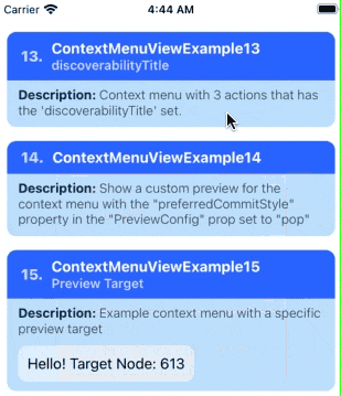
ContextMenuView Example 14
Summary: Context Menu Previews — An example that changes the exit transition of the context menu preview when its tapped using the preferredCommitStyle config.
| Notes |
|---|
The MenuPreviewConfig.preferredCommitStyle allows you to configure what preset exit transition to use when the context menu preview is pressed.📝 Note A: By default, MenuPreviewConfig.preferredCommitStyle is set to 'dismiss'.📝 Note B: A preferredCommitStyle of 'pop'' is usually used when navigating to another screen (i.e. a view controller is pushed without the normal push transition). |
 // 📝 Note: for the sake of brevity, some of the code is omitted...
export function ContextMenuViewExample14(props) {
  return (
    <ContextMenuView
      previewConfig={{
        previewType: 'CUSTOM',
        previewSize: 'STRETCH',
        backgroundColor: 'rgba(255,255,255,0.75)',
	      // change the exit transition that occurs when the
        // context menu preview is pressed.
        preferredCommitStyle: 'pop',
      }}
      renderPreview={() => (
        {/** ... */}
      )}
    >
      {/** Components */}
    </ContextMenuView>
  );
};
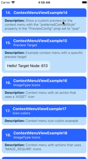
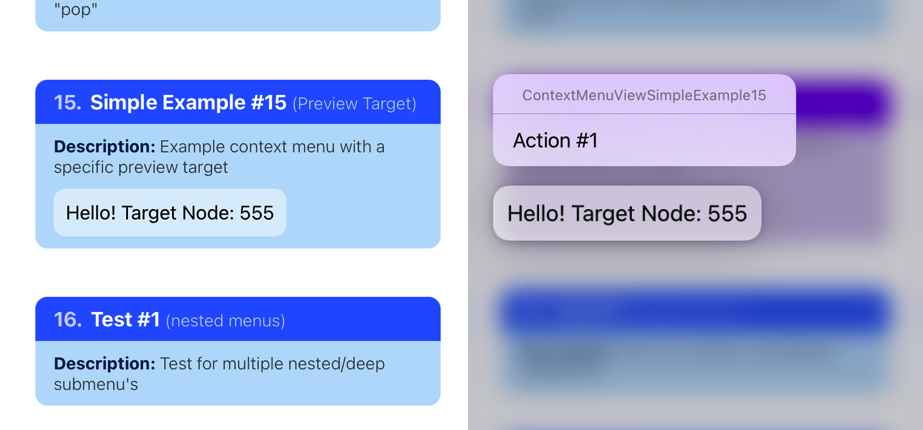
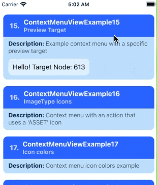
ContextMenuView Example 15
Summary: Context Menu Previews — An example showing how to configure a context menu that uses targeted previews.
| Notes |
|---|
By default, the child elements you render inside the ContextMenuView component will be used as the preview when the context menu interaction is triggered.Targeted previews allows you to specify which specific view to use for the context menu preview, so that when the context menu interaction begins, a different view will be used for the preview (including the initial transition, see the gif below the example code). 📝 Note A: The context menu interaction will still be triggered by long pressing on the child elements in the ContextMenuView component.As such, if the view that you are using for the targeted preview is not a child of ContextMenuView, then holding down on that view will not trigger the context menu interaction.📝 Note B: Targeted previews is different from setting a custom context menu preview via the renderPreview prop.A custom preview will replace the contents of the context menu preview entirely with your custom view component once the menu is opened. A targeted preview on the other hand will change which view to use for the context menu entrance/exit transition (as well as what view to show in the preview if you do not have a custom preview). |
 // 📝 Note: for the sake of brevity, some of the code is omitted...
import { ContextMenuView } from 'react-native-ios-context-menu';

export function ContextMenuViewExample15(props) {
  const [targetViewNode, setTargetViewNode] = React.useState();

  React.useEffect(() => {
    // please note that when a view unmounts and remounts (e.g.
    // when you have a view inside a list comp)., you need to
    // get the new associated `reactTag` for that view
    //
    // otherwise the `reactTag` value you provide to the
    // `previewConfig` will be stale...
    //
    // this is why we have to set `targetViewNode` back to
    // `udefined` when the component unmounts
    return () => {
      setTargetViewNode(undefined);
    }
  }, []);

  return (
    <ContextMenuView
      menuConfig={{
        // ...
      }}
      previewConfig={{
        // specify which view to use as the preview target
        targetViewNode: targetViewNode,
      }}
    >
      <View
        style={styles.targetContainer}
        // we need to get the `reactTag` of the view; one way is
        // to get it from the `onLayout` event
        //
        // alternatively, you can also obtain the `reactTag` of a
        // a view via: `nativeViewRef?.nativeTag`
        //
        // the `reactTag` for a given view is the same across re-renders,
        // so we only really need to get it once when the view mounts...
        //
        onLayout={!targetViewNode && (({nativeEvent}) => {
          setTargetViewNode(nativeEvent.target)
        })}
      >
        <Text style={styles.text}>
          {`Hello! Target Node: ${targetViewNode}`}
        </Text>
      </View>
    </ContextMenuView>
  );
};
ContextMenuView Example 15-02
Summary: Context Menu Previews (Cont). — An example showing how to configure a context menu that uses targeted previews + WrapperView.
// 📝 Note: for the sake of brevity, some of the code is omitted...
import { ContextMenuView } from 'react-native-ios-context-menu';
import { WrapperView } from 'react-native-ios-utilities';

export function ContextMenuViewExample15_02(props) {
  // save a ref. to the `WrapperView` element containing the preview target you
  // want to use for the context menu.
  //
  // you can then call `getNativeReactTag` to get the associated `reactTag`
  // for that view.
  const wrapperViewRef = React.useRef();

  return (
    <ContextMenuView
      menuConfig={{
        // ...
      }}
      previewConfig={{
        // get the associated `reactTag` of the view element you want use as the
        // preview target
        targetViewNode: wrapperViewRef.current?.getNativeReactTag(),
      }}
    >
      <WrapperView
        ref={wrapperViewRef}
        style={styles.targetContainer}
      >
        <Text style={styles.text}>
          {`Hello inside: WrapperView\nTarget Node: ${wrapperViewRef.current?.getNativeReactTag()}`}
        </Text>
      </WrapperView>
    </ContextMenuView>
  );
};

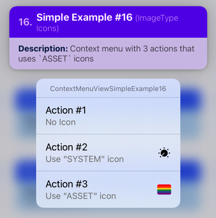
ContextMenuView Example 16
Summary: Icon Example — An example showing a context menu with an action that uses a 'IMAGE_ASSET' image for its icon.
| Notes |
|---|
A config of ImageItemConfig.type set to 'IMAGE_ASSET' means that you want to use a xcasset image asset.📝 Note: The string value you pass to the ImageItemConfig.imageValue must match the corresponding asset that you want to use in your project's xcasset catalog. |
 // 📝 Note: for the sake of brevity, some of the code is omitted...
import { ContextMenuView } from 'react-native-ios-context-menu';

export function ContextMenuViewExample16(props) {
  return (
    <ContextMenuView
      menuConfig={{
        menuTitle: 'ContextMenuViewExample16',
        menuItems: [{
          actionKey: 'key-01',
          actionTitle: 'Action #1',
          // ...
        }, {
          actionKey: 'key-02'   ,
          actionTitle: 'Action #2',
          // ...
        }, {
          actionKey  : 'key-03'   ,
          actionTitle: 'Action #3',
          discoverabilityTitle: 'Use "ASSET" icon',
          icon: {
            // specify that you want to use an asset icon
            type: 'IMAGE_ASSET',
            // pass the name of the asset
            imageValue: 'icon-rainbow-flag',
          }
        }],
      }}
    >
      {/** Components */}
    </ContextMenuView>
  );
};

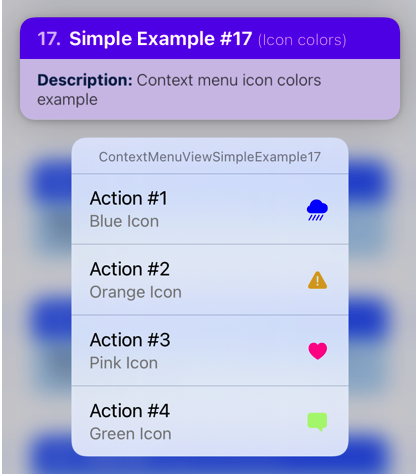
ContextMenuView Example 17
Summary: Icon Example — An example showing a context menu with action items that have different colored icons.
| Notes |
|---|
A ImageItemConfig object has an optional called imageOptions. This property accepts a UIImageConfig object.You can tint the image to a specified color using the UIImageConfig.tint property. This property accepts a color string in either rgb, rgba, or hex format.You can also choose to provide a dynamic color config if you want to use a specific color for light/dark mode. 📝 Note A: Any image can be tinted to a specific color, not just 'IMAGE_SYSTEM' images.📝 Note B: In order for the tint to take effect, set UIImageConfig.renderingMode to alwaysOriginal. |
 // 📝 Note: for the sake of brevity, some of the code is omitted...
import { ContextMenuView } from 'react-native-ios-context-menu';

export function ContextMenuViewExample17(props) {
  return (
    <ContextMenuView
      menuConfig={{
        menuTitle: 'ContextMenuViewExample17',
        menuItems: [{
          actionKey  : 'key-01',
          actionTitle: 'Action #1',
          icon: {
            type: 'IMAGE_SYSTEM',
            imageValue: {
              systemName: 'cloud.heavyrain.fill',
            },
            // blue icon
            imageOptions: {
              tint: 'blue',
              renderingMode: 'alwaysOriginal',
            },
          },
        }, {
          actionKey  : 'key-02',
          actionTitle: 'Action #2',
          icon: {
            // ...
            // orange icon
            imageOptions: {
              tint: 'rgb(218,165,32)',
              renderingMode: 'alwaysOriginal',
            },
          },
        }, {
          actionKey  : 'key-03',
          actionTitle: 'Action #3',
          icon: {
            // ...
            // pink icon
            imageOptions: {
              tint: '#FF1493',
              renderingMode: 'alwaysOriginal',
            },
          },
        }, {
          actionKey  : 'key-04',
          actionTitle: 'Action #4',
          icon: {
            // ...
            // green icon
            imageOptions: {
              tint: 'rgba(124,252,0,0.5)',
              renderingMode: 'alwaysOriginal',
            },
          },
        }]
      }}
    >
      {/** Components */}
    </ContextMenuView>
  );
};
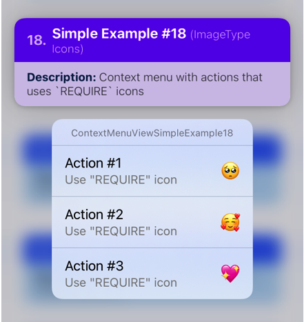
ContextMenuView Example 18
Summary: Icon Example — An example showing a context menu with action items that has icons that uses local image assets imported via require(...).
| Notes |
|---|
1️⃣ — The first step that we need to do is to generate a ImageResolvedAssetSource object of the local image asset we want to use. This object contains metadata about the image as well as its URI in the file system.The Image.resolveAssetSource function returns a ImageResolvedAssetSource that corresponds to the source argument you pass into it. Give this function the return value of require(path/to/image.png). |
2️⃣ — A config of ImageItemConfig.type set to 'IMAGE_REQUIRE' means that we want to use a local image asset imported via the require(...) function.The ImageItemConfig.imageValue property accepts a ImageResolvedAssetSource object that corresponds to the image asset that you want to use. |
 // 📝 Note: for the sake of brevity, some of the code is omitted...
import { ContextMenuView } from 'react-native-ios-context-menu';

// Generate a `ImageResolvedAssetSource` object based on the
// image assets...

const iconA = Image.resolveAssetSource(
  require('../assets/emoji-pleading-face.png')
);

const iconB = Image.resolveAssetSource(
  require('../assets/emoji-smiling-face-with-hearts.png')
);

const iconC = Image.resolveAssetSource(
  require('../assets/emoji-sparkling-heart.png')
);

export function ContextMenuViewExample18(props) {
  return (
    <ContextMenuView
      menuConfig={{
        menuTitle: 'ContextMenuViewExample18',
        menuItems: [{
          actionKey  : 'key-01'   ,
          actionTitle: 'Action #1',
          discoverabilityTitle: 'Use "REQUIRE" icon',
          // `IconConfig` has been deprecated, please use
          // `ImageItemConfig` instead (but it'll still work
          // for now).
          //
          // The other two menu actions in this example
          // uses `ImageItemConfig` to set the menu action icons.
          icon: {
            iconType: 'REQUIRE',
            iconValue: iconA,
          }
        }, {
          actionKey: 'key-02'   ,
          actionTitle: 'Action #2',

          // Set config to use images via `require`
          type: 'IMAGE_REQUIRE',

          // Pass in the corresponding
          // `ImageResolvedAssetSource` object of the image
          // that you want to use as the icon...
          imageValue: iconB,
        }, {
          actionKey: 'key-03'   ,
          actionTitle: 'Action #3',
          icon: {
            type: 'IMAGE_REQUIRE',
            imageValue: iconC,
          }
        }],
      }}
    >
      {/** Components */}
    </ContextMenuView>
  );
};
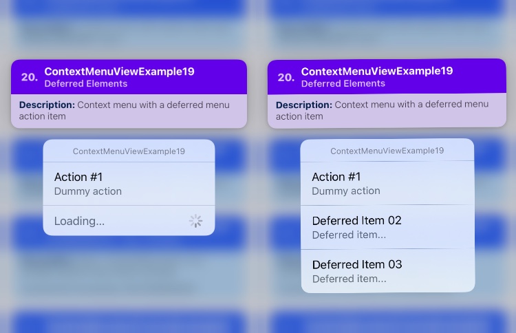
ContextMenuView Example 19
Summary: Dynamic Menu — An example showing a context menu that shows a loading indicator using deferred menu elements.
| Notes |
|---|
1️⃣ — If you control your ContextMenuView.menuConfig via state, then you can already dynamically add menu items while the context menu is visible (See ContextMenuView Example 10). However, there is no indication in the UI that items are currently being loaded.You can use a "deferred element" in order to add an action item that has a loading indicator. Once you are done loading the content, then you can replace the deferred element with the actual menu items that you want to add. 📝 Note: Deferred elements are only available on iOS 14 and above. |
2️⃣ — As mentioned in the previous examples, the MenuConfig.menuItems property can accept an array of MenuElementConfig union type. This means that it can accept an array containing any of the following object types: MenuConfig object, MenuActionConfig, and DeferredMenuElementConfig.If we pass in a DeferredMenuElementConfig to menuItems, it means that we want to create "deferred element" item. |
3️⃣ — To create a deferred element, we just need to create a "config" object that has a property containing both type and deferredID.The DeferredMenuElementConfig.type property must be set to a string value of 'deferred'. This indicates that we want to create a deferred element.The DeferredMenuElementConfig.deferredID property must be set to a unique string value. Since we can have multiple deferred elements, the value you pass into this property will be used to identify which deferred element will be replaced with the menu items you want to add when the loading is complete. |
4️⃣ — Once the context menu is open, any deferred menu items in MenuConfig.menuItems will trigger the ContextMenuView.onRequestDeferredElement event to fire. Via the event, you will receive two arguments: deferredID string and provider callback function.The deferredID string corresponds to which deferred element that we need to load, while the provider callback function is used to provide the menu items that we want to add and replace the deferred element with. |
5️⃣ — The provider callback function accepts an array of MenuElementConfig items.To replace the deferred element with the menu items you want add, simply call the provider callback function with the array of MenuConfig, MenuActionConfig, or DeferredMenuElementConfig objects.📝 Note A: Since the deferred elements were loaded/replaced using the onRequestDeferredElement event, there are now two sources of truths for the context menu config: One provided via the ContextMenuView.menuConfig prop, and the other via the onRequestDeferredElement event.If you are using a state-controlled menu config, see: ContextMenuView Example 20.📝 Note B: It is recommended that you cache the items you have loaded, and then combine them with the existing menuConfig once the menu has been closed. |
// 📝 Note: for the sake of brevity, some of the code is omitted...
export function ContextMenuViewExample19(props) {
  return (
    <ContextMenuView
      menuConfig={{
        menuTitle: 'ContextMenuViewExample19',
        menuItems: [{
          actionKey  : 'key-01',
          actionTitle: 'Action #1',
          actionSubtitle: 'Dummy action'
        }, {
          // Create a deferred menu item...
          // this will act as a placeholder and will be replaced
          // with the actual menu items later
          type: 'deferred',

          // if we have multiple deferred items, you can use
          // the `deferredID` to distinguish between them
          deferredID: 'deferred-01'
        }],
      }}

      // this event will fire when a deferred menu item
      // is present...
      onRequestDeferredElement={async (deferredID, provider) => {
        switch(deferredID) {
          case 'deferred-01':
            // dummy delay, wait for 1 second...
            await Helpers.timeout(1000);

            // provide the items to add to the context menu...
            provider([{
              type: 'action',
              actionKey: 'action-02',
              actionTitle: 'Deferred Item 02',
              actionSubtitle: 'Deferred item...'
            }, {
              type: 'action',
              actionKey: 'action-03',
              actionTitle: 'Deferred Item 03',
              actionSubtitle: 'Deferred item...'
            }]);
            break;
        };
      }}
    >
      {/** ... */}
    </ContextMenuView>
  );
};
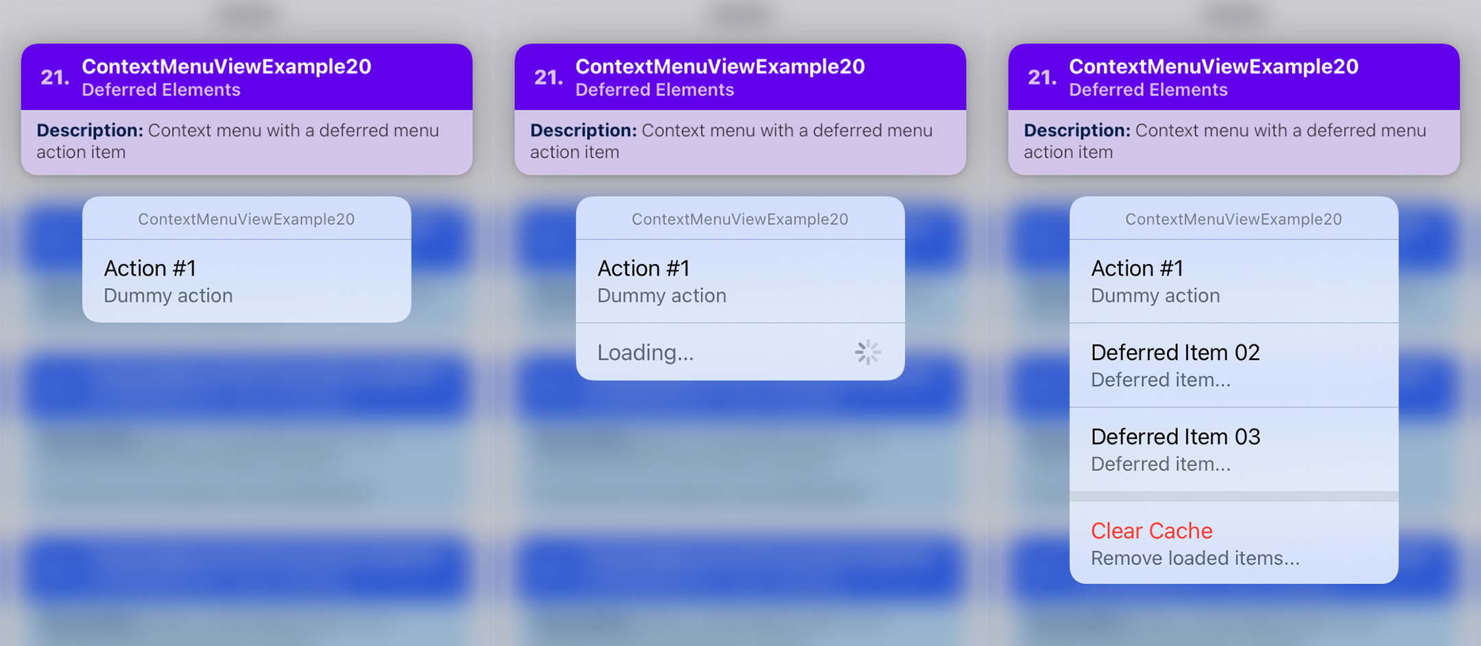
ContextMenuView Example 20
Summary: Dynamic Menu — An example showing a state-controlled context menu that shows a loading indicator using deferred menu elements.
| Notes |
|---|
| TBA |
// 📝 Note: for the sake of brevity, some of the code is omitted...
export function ContextMenuViewExample20(props) {
  const [extraMenuItems, setExtraMenuItems] = React.useState([]);

  const [isLoading, setIsLoading] = React.useState(true);
  const [didLoadItems, setDidLoadItems] = React.useState(false);

  return (
    <ContextMenuView
      menuConfig={{
        menuTitle: 'ContextMenuViewExample20',
        menuItems: [{
          actionKey  : 'key-01',
          actionTitle: 'Action #1',
          actionSubtitle: 'Dummy action'
        },

        // add deferred item so that the loading indicator
        // appears...
        isLoading && ({
          type: 'deferred',
          deferredID: 'deferred-01'
        }),

        // add the extra menu items...
        ...extraMenuItems,

        didLoadItems && ({
          type: 'menu',
          menuTitle: '',
          menuOptions: ['displayInline'],
          menuItems: [{
            type: 'action',
            actionKey: 'clear_cache',
            actionTitle: 'Clear Cache',
            actionSubtitle: 'Remove loaded items...',
            menuAttributes: ['destructive'],
          }]
        })],
      }}
      // this event will fire when a deferred menu item is present...
      onMenuWillShow={async () => {
        if(didLoadItems) return;

        // for the purposes of this example, let's add a delay
        // before showing the loading indicator...
        //
        // this way, we can see the context menu updating and
        // showing the loading indicator.
        //
        // Ideally, `isLoading` should already be set to `true`
        // before the context menu is shown...
        await Helpers.timeout(750);
        setIsLoading(true);

        // loading...
        // dummy delay, wait for 2 second...
        await Helpers.timeout(2000);
        setDidLoadItems(true);

        // add extra menu items
        setExtraMenuItems([{
          type: 'action',
          actionKey: 'action-02',
          actionTitle: 'Deferred Item 02',
          actionSubtitle: 'Deferred item...'
        }, {
          type: 'action',
          actionKey: 'action-03',
          actionTitle: 'Deferred Item 03',
          actionSubtitle: 'Deferred item...'
        }]);

        // hide the loading indicator
        setIsLoading(false);
      }}
    >
      {/** ... */}
    </ContextMenuView>
  );
};
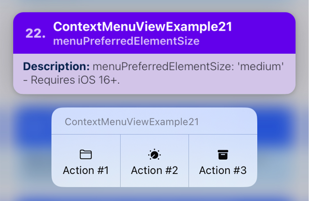
ContextMenuView Example 21
Summary: Menu Element Size — TBA
| Notes |
|---|
| TBA |
// 📝 Note: for the sake of brevity, some of the code is omitted...
export function ContextMenuViewExample21(props) {

  return (
    <ContextMenuView
      menuConfig={{
        menuTitle: 'ContextMenuViewExample21',
        menuPreferredElementSize: 'medium',
        menuItems: [{
          actionKey: 'key-01',
          actionTitle: 'Action #1',
          // ...
        }, {
          actionKey: 'key-02'   ,
          actionTitle: 'Action #2',
          // ...

        }, {
          actionKey  : 'key-03'   ,
          actionTitle: 'Action #3',
          // ...
        }],
      }}
    >
      {/** ... */}
    </ContextMenuView>
  );
};

ContextMenuView Example 22
Summary: Menu Element Size — TBA
| Notes |
|---|
| TBA |
// 📝 Note: for the sake of brevity, some of the code is omitted...
export function ContextMenuViewExample22(props) {

  return (
    <ContextMenuView
      menuConfig={{
        menuTitle: '',
        menuPreferredElementSize: 'small',
        menuItems: [{
          actionKey: 'key-01',
          actionTitle: '',
          // ...
        }, {
          actionKey: 'key-02'   ,
          actionTitle: '',
          // ...
          }
        }, {
          actionKey: 'key-03',
          actionTitle: '',
          // ...
        }],
      }}
    >
      {/** ... */}
    </ContextMenuView>
  );
};

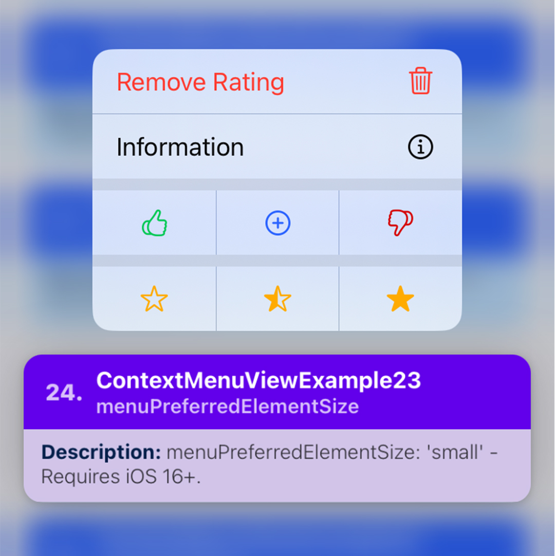
ContextMenuView Example 23
Summary: Menu Element Size — TBA
| Notes |
|---|
// 📝 Note: for the sake of brevity, some of the code is omitted...
export function ContextMenuViewExample23(props) {

  return (
    <ContextMenuView
      menuConfig={{
        menuTitle: '',
        menuItems: [{
          type: 'action',
          actionKey: 'remove-rating',
          menuAttributes: ['destructive'],
          actionTitle: 'Remove Rating',
           icon: { /** ... */ }
        }, {
          type: 'action',
          actionKey: 'info',
          actionTitle: 'Information',
           icon: { /** ... */ }
        }, {
          type: 'menu',
          menuTitle: '',
          menuOptions: ['displayInline'],
          menuPreferredElementSize: 'small',
          menuItems: [{
            actionKey: 'key-01-01',
            actionTitle: '',
            icon: { /** ... */ }
          }, {
            actionKey: 'key-01-02',
            actionTitle: '',
            icon: { /** ... */ }
          }, {
            actionKey: 'key-01-03',
            actionTitle: '',
            icon: { /** ... */ }
          }],
        }, {
          type: 'menu',
          menuTitle: '',
          menuOptions: ['displayInline'],
          menuPreferredElementSize: 'small',
          menuItems: [{
            actionKey: 'key-02-01',
            actionTitle: '',
            icon: { /** ... */ }
          }, {
            actionKey: 'key-02-02',
            actionTitle: '',
            icon: { /** ... */ }
          }, {
            actionKey: 'key-02-03',
            actionTitle: '',
            icon: { /** ... */ }
          }],
        }]
      }}
    >
      { /** ... */ }
    </ContextMenuView>
  );
};
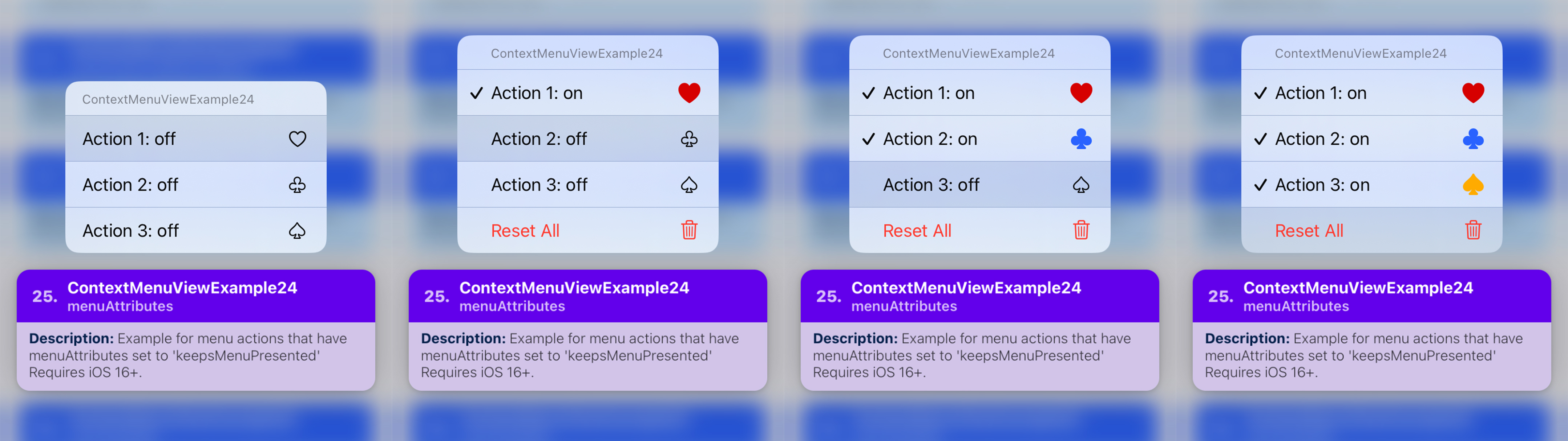
ContextMenuView Example 24
Summary: Menu Attributes — keepsMenuPresented
| Notes |
|---|
| TBA |
// 📝 Note: for the sake of brevity, some of the code is omitted...
export function ContextMenuViewExample24(props) {
  const [actionState1, setActionState1] = React.useState(false);
  const [actionState2, setActionState2] = React.useState(false);
  const [actionState3, setActionState3] = React.useState(false);

  const isResetEnabled = (
    actionState1 ||
    actionState2 ||
    actionState3
  );

  const handleOnPressMenuItem = ({nativeEvent}) => {
    // ...
  };

  return (
    <ContextMenuView
      style={props.style}
      onPressMenuItem={handleOnPressMenuItem}
      menuConfig={{
        menuTitle: 'ContextMenuViewExample24',
        menuItems: [{
          actionKey: 'key-01',
          actionTitle: `Action 1: ${actionState1? 'on' : 'off'}`,
          menuState: (actionState1? 'on' : 'off'),
          menuAttributes: ['keepsMenuPresented'],
          icon: { /** ... */ }
        }, {
          actionKey  : 'key-02',
          actionTitle: `Action 2: ${actionState2? 'on' : 'off'}`,
          menuState  : (actionState2? 'on' : 'off'),
          menuAttributes: ['keepsMenuPresented'],
          icon: { /** ... */ }
        }, {
          actionKey: 'key-03',
          actionTitle: `Action 3: ${actionState3? 'on' : 'off'}`,
          menuState: (actionState3? 'on' : 'off'),
          menuAttributes: ['keepsMenuPresented'],
          icon: { /** ... */ }
        }, {
          actionKey: 'key-04',
          actionTitle: `Reset All`,
          menuAttributes: [
            'keepsMenuPresented',
            isResetEnabled? 'destructive' : 'hidden',
          ],
          icon: { /** ... */ }
        }]
      }}
    >
      { /** ... */ }
    </ContextMenuView>
  );
};
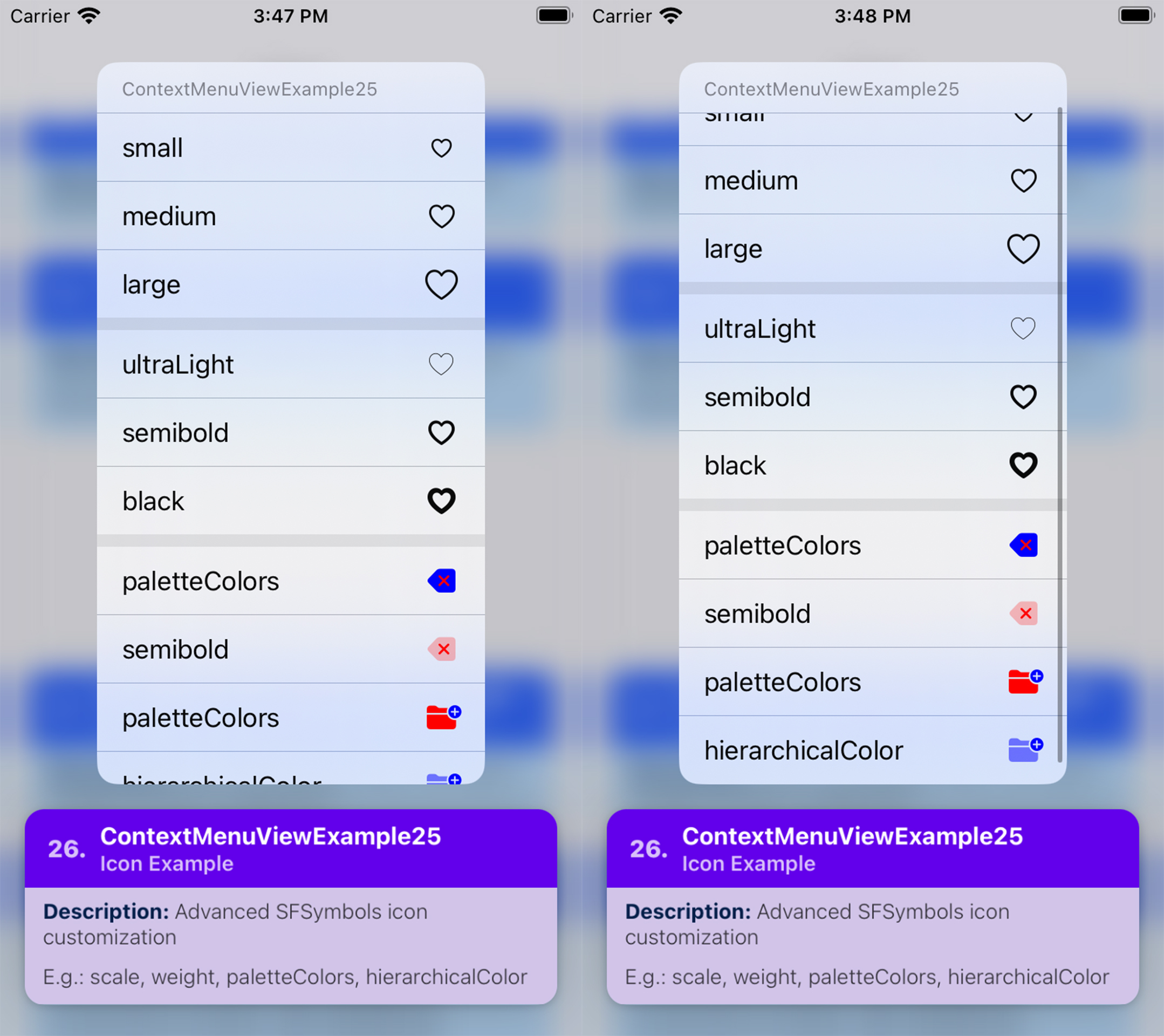
ContextMenuView Example 25
Summary: Icon Example — Advanced customization (e.g. scale, weight, paletteColors, hierarchicalColor).
| Notes |
|---|
| TBA |
// 📝 Note: for the sake of brevity, some of the code is omitted...
export function ContextMenuViewExample25(props) {
  return (
    <ContextMenuView
      style={props.style}
      menuConfig={{
        menuTitle: 'ContextMenuViewExample25',
        menuItems: [{
          type: 'menu',
          menuTitle: '',
          menuOptions: ['displayInline'],
          menuItems: [{
            actionKey: 'key-01-01',
            actionTitle: 'small',
            icon: {
              type: 'IMAGE_SYSTEM',
              imageValue: {
                systemName: 'heart',
                scale: 'small',
              },
            }
          }, {
            actionKey: 'key-01-02',
            actionTitle: 'medium',
            icon: {
              type: 'IMAGE_SYSTEM',
              imageValue: {
                systemName: 'heart',
                scale: 'medium',
              },
            }
          }, {
            actionKey: 'key-01-03',
            actionTitle: 'large',
            icon: {
              type: 'IMAGE_SYSTEM',
              imageValue: {
                systemName: 'heart',
                scale: 'large',
              },
            }
          }],
        }, {
          type: 'menu',
          menuTitle: '',
          menuOptions: ['displayInline'],
          menuItems: [{
            actionKey: 'key-02-01',
            actionTitle: 'ultraLight',
            icon: {
              type: 'IMAGE_SYSTEM',
              imageValue: {
                systemName: 'heart',
                weight: 'ultraLight',
              },
            }
          }, {
            actionKey: 'key-02-02',
            actionTitle: 'semibold',
            icon: {
              type: 'IMAGE_SYSTEM',
              imageValue: {
                systemName: 'heart',
                weight: 'semibold',
              },
            }
          }, {
            actionKey: 'key-02-03',
            actionTitle: 'black',
            icon: {
              type: 'IMAGE_SYSTEM',
              imageValue: {
                systemName: 'heart',
                weight: 'black',
              },
            }
          }],
        },  {
          type: 'menu',
          menuTitle: '',
          menuOptions: ['displayInline'],
          menuItems: [{
            actionKey: 'key-03-01',
            actionTitle: 'paletteColors',
            icon: {
              type: 'IMAGE_SYSTEM',
              imageValue: {
                systemName: 'delete.left.fill',
                paletteColors: ['red', 'blue']
              },
            }
          }, {
            actionKey: 'key-03-02',
            actionTitle: 'semibold',
            icon: {
              type: 'IMAGE_SYSTEM',
              imageValue: {
                systemName: 'delete.left.fill',
                hierarchicalColor: 'red',
              },
            }
          }, {
            actionKey: 'key-03-03',
            actionTitle: 'paletteColors',
            icon: {
              type: 'IMAGE_SYSTEM',
              imageValue: {
                systemName: 'folder.fill.badge.plus',
                paletteColors: ['blue', 'red']
              },
            }
          },  {
            actionKey: 'key-03-04',
            actionTitle: 'hierarchicalColor',
            icon: {
              type: 'IMAGE_SYSTEM',
              imageValue: {
                systemName: 'folder.fill.badge.plus',
                hierarchicalColor: 'blue',
              },
            }
          }],
        }],
      }}
    >
      {/** .... */}
    </ContextMenuView>
  );
};
ContextMenuView Example 26
Summary: Icon Example — Network/Remote images as icons.
| Notes |
|---|
| TBA |
// 📝 Note: for the sake of brevity, some of the code is omitted...
export function ContextMenuViewExample26(props) {
  return (
    <ContextMenuView
      menuConfig={{
        menuTitle: 'ContextMenuViewExample26',
        menuItems: [{
          actionKey  : 'key-01'   ,
          actionTitle: 'Action #1',
          menuSubtitle: 'Use "IMAGE_REMOTE_URL" icon',
          icon: {
            type: 'IMAGE_REMOTE_URL',
            imageValue: {
              url: 'https://picsum.photos/id/1/100'
            },
          }
        }, {
          actionKey  : 'key-02'   ,
          actionTitle: 'Action #2',
          menuSubtitle: '"IMAGE_REMOTE_URL" + shouldLazyLoad',
          icon: {
            type: 'IMAGE_REMOTE_URL',
            imageValue: {
              url: 'https://picsum.photos/id/2/100'
            },
            imageLoadingConfig: {
              shouldLazyLoad: true,
            },
            imageOptions: {
              cornerRadius: 15,
            },
          }
        }, {
          actionKey  : 'key-03'   ,
          actionTitle: 'Action #3',
          menuSubtitle: '"IMAGE_REMOTE_URL" + shouldLazyLoad + shouldCache',
          icon: {
            type: 'IMAGE_REMOTE_URL',
            imageValue: {
              url: 'https://picsum.photos/id/2/100'
            },
            imageLoadingConfig: {
              shouldLazyLoad: true,
              shouldCache: true,
            },
            imageOptions: {
              cornerRadius: 30,
              tint: 'rgba(255,0,0,0.5)',
              renderingMode: 'alwaysOriginal',
            },
          }
        }],
      }}
    >
      {/** ... */}
    </ContextMenuView>
  );
};

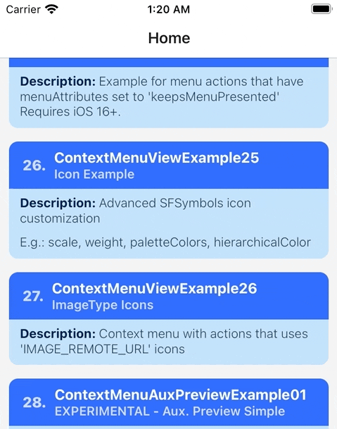
ContextMenuView Example 27
Summary: Icon Example — Network/Remote images as icons + fallback image.
| Notes |
|---|
| TBA |
// 📝 Note: for the sake of brevity, some of the code is omitted...
export function ContextMenuViewExample27(props) {
  return (
    <ContextMenuView
      menuConfig={{
        menuTitle: 'ContextMenuViewExample27',
        menuItems: [{
          actionKey  : 'key-01'   ,
          actionTitle: 'Action #1',
          actionSubtitle: 'fallbackBehavior: whileNotLoaded',
          icon: {
            type: 'IMAGE_REMOTE_URL',
            imageValue: {
              url: 'https://fake.url.com/asset-1',
              fallbackImage: {
                type: 'IMAGE_SYSTEM',
                imageValue: {
                  systemName: 'trash',
                },
              },
            },
            imageLoadingConfig: {
              // will use the fallback image while the remote
              // image hasn't been loaded yet
              fallbackBehavior: 'whileNotLoaded',
              shouldLazyLoad: true,
              shouldImmediatelyRetryLoading: true,
              maxRetryAttempts: 20,
            },
          },
        }, {
          actionKey  : 'key-02'   ,
          actionTitle: 'Action #2',
          actionSubtitle: 'fallbackBehavior: onLoadError',
          icon: {
            type: 'IMAGE_REMOTE_URL',
            imageValue: {
              url: 'https://fake.url.com/asset-2',
              fallbackImage: {
                type: 'IMAGE_SYSTEM',
                imageValue: {
                  systemName: 'trash',
                },
              },
            },
            imageLoadingConfig: {
              // will use the fallback image when it encounters
              // an error whe loading the remote image
              fallbackBehavior: 'onLoadError',
              shouldLazyLoad: true,
              shouldImmediatelyRetryLoading: true,
              maxRetryAttempts: 20,
            },
          }
        },  {
          actionKey  : 'key-03'   ,
          actionTitle: 'Action #3',
          actionSubtitle: 'fallbackBehavior: afterFinalAttempt',
          icon: {
            type: 'IMAGE_REMOTE_URL',
            imageValue: {
              url: 'https://fake.url.com/asset-3',
              fallbackImage: {
                type: 'IMAGE_SYSTEM',
                imageValue: {
                  systemName: 'trash',
                },
              },
            },
            imageLoadingConfig: {
              // will use the fallback image when it encounters
              // an error whe loading the remote image, and the
              // number of loading attempts exceeds
              // `maxRetryAttempts`
              fallbackBehavior: 'afterFinalAttempt',
              shouldLazyLoad: true,
              shouldImmediatelyRetryLoading: true,
              maxRetryAttempts: 20,
            },
          }
        }],
      }}
    >
      {/** ... */}
    </ContextMenuView>
  );
};
ContextMenuView Example 28
Summary: Programmatically shows the context menu
| Notes |
|---|
| TBA |
// 📝 Note: for the sake of brevity, some of the code is omitted...
export function ContextMenuViewExample28(props) {
  const menuRef = React.useRef<ContextMenuView>(null);

  return (
    <ContextMenuView
      ref={menuRef}
      menuConfig={{ /* ... */ }}
    >
      <ContextMenuCard /* ... */>
        <CardButton
          title={'Show Context Menu'}
          subtitle={'Programmatically shows the context menu'}
          onPress={() => {
            menuRef.current?.presentMenu();
          }}
        />
      </ContextMenuCard>
    </ContextMenuView>
  );
};

ContextMenuView Auxiliary Preview - Example 01
Summary: TBA
| Notes |
|---|
| TBA 📝 Note A: |
// 📝 Note: for the sake of brevity, some of the code is omitted...
export function ContextMenuAuxPreviewExample01() {
  return (
    <ContextMenuView
      menuConfig={{
        // ...
      }}
      isAuxiliaryPreviewEnabled={true}
      renderAuxiliaryPreview={() => (
        <View style={[styles.auxRootContainer, {
          // The view you return will be wrapped by another view.
          // The parent view will be resized to match the width of the aux.
          // preview.
          //
          // since this view is going to be resized, let's stretch to match the
          // the size of the parent, and center the content
          flex: 1,
          alignItems: 'center',
          justifyContent: 'center',
        }]}>
          <TouchableOpacity style={styles.buttonContainer}>
            { /** ... */ }
          </TouchableOpacity>
        </View>
      )}
    >
      {/** ... */}
    </ContextMenuView>
  );
};


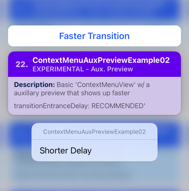
ContextMenuView Auxiliary Preview - Example 02
Summary: TBA
| Notes |
|---|
| TBA 📝 Note A: |
// 📝 Note: for the sake of brevity, some of the code is omitted...
export function ContextMenuAuxPreviewExample02() {
  return (
    <ContextMenuView
      menuConfig={{
        // ...
      }}
      // If you want to immediately show the aux. preview, then
      // set `transitionEntranceDelay` to: `RECOMMENDED`.
      //
      // The default is: `AFTER_PREVIEW`.
      //
      // You can also pass in a number indicating how long delay
      // is in seconds  (e.g. 0.3).
      //
      // Note: Do not pass in a number below 0.25 to avoid any
      // layout bugs...
      auxiliaryPreviewConfig={{
        transitionEntranceDelay: 'RECOMMENDED'
      }}
      renderAuxiliaryPreview={() => (
        <View style={styles.auxRootContainer}>
          <Text style={styles.textLabel}>
            Faster Transition
          </Text>
        </View>
      )}
    >
      {/** ... */}
    </ContextMenuView>
  );
};
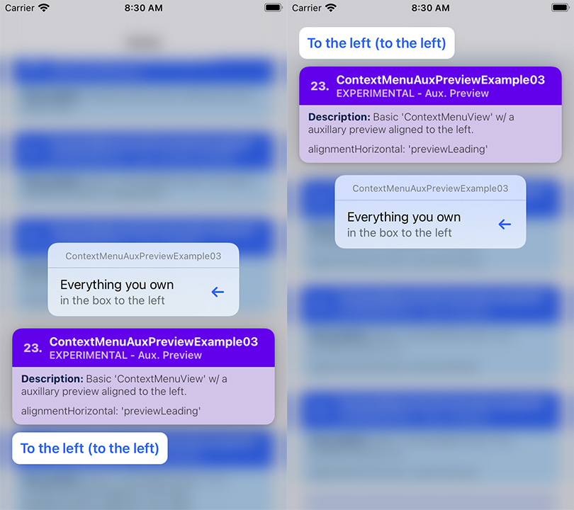
ContextMenuView Auxiliary Preview - Example 03
Summary: TBA
| Notes |
|---|
| TBA 📝 Note A: |
// 📝 Note: for the sake of brevity, some of the code is omitted...
export function ContextMenuAuxPreviewExample03() {
  return (
    <ContextMenuView
      menuConfig={{
        // ...
      }}
      auxiliaryPreviewConfig={{
        // Align the aux. preview to the left...
        // 📝 Note: By default, this is set to: `stretchPreview`
        alignmentHorizontal: 'previewLeading',
      }}
      renderAuxiliaryPreview={() => (
        <View style={styles.auxRootContainer}>
          <Text style={styles.textLabel}>
            To the left (to the left)
          </Text>
        </View>
      )}
    >
      {/** ... */}
    </ContextMenuView>
  );
};
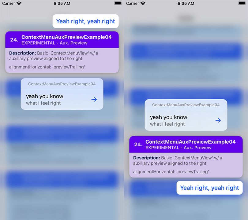
ContextMenuView Auxiliary Preview - Example 04
Summary: TBA
| Notes |
|---|
| TBA 📝 Note A: |
// 📝 Note: for the sake of brevity, some of the code is omitted...
export function ContextMenuAuxPreviewExample04() {
  return (
    <ContextMenuView
      menuConfig={{
        // ...
      }}
      auxiliaryPreviewConfig={{
        // Align the aux. preview to the right...
        // 📝 Note: By default, this is set to: `stretchPreview`
        alignmentHorizontal: 'previewTrailing',
      }}
      renderAuxiliaryPreview={() => (
        <View style={styles.auxRootContainer}>
          <Text style={styles.textLabel}>
            Yeah right, yeah right
          </Text>
        </View>
      )}
    >
      {/** ... */}
    </ContextMenuView>
  );
};
ContextMenuView Auxiliary Preview - Example 05
Summary: TBA
| Notes |
|---|
| TBA 📝 Note A: |
// 📝 Note: for the sake of brevity, some of the code is omitted...
export function ContextMenuAuxPreviewExample05() {
return (
<ContextMenuView
menuConfig={{
// ...
}}
// Align the aux. preview to the center of the context
// menu preview...
//
// 📝 Note: By default, this is set to: `stretchPreview`
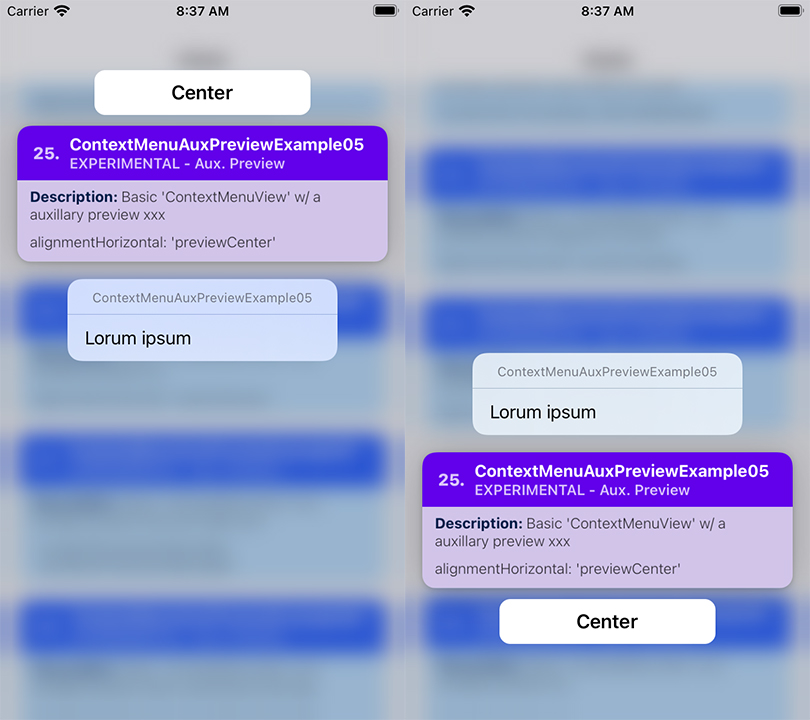
auxiliaryPreviewConfig={{
alignmentHorizontal: 'previewCenter',
}}
renderAuxiliaryPreview={() => (
<View style={styles.auxRootContainer}>
<Text style={styles.textLabel}>
Center
</Text>
</View>
)}
>
{ /** ... */ }
</ContextMenuView>
);
};
ContextMenuView Auxiliary Preview - Example 06
Summary: TBA
| Notes |
|---|
| TBA 📝 Note A: |
// 📝 Note: for the sake of brevity, some of the code is omitted...
export function ContextMenuAuxPreviewExample06(props) {
  return (
    <ContextMenuView
      menuConfig={{
        // ...
      }}
      auxiliaryPreviewConfig={{
        // Configure the aux. preview to use the entire width of
        // the screen...
        //
        // 📝 Note: By default, this is set to: `stretchPreview`
        alignmentHorizontal: 'stretchScreen',
      }}
      renderAuxiliaryPreview={() => (
        <View style={styles.auxRootContainer}>
          <View style={styles.innerContainer}>
            <Text style={styles.textLabel}>
              Stretch to Edges of Screen
            </Text>
          </View>
        </View>
      )}
    >
      {/** ... */}
    </ContextMenuView>
  );
};

ContextMenuView Auxiliary Preview - Example 07
Summary: TBA
| Notes |
|---|
| TBA 📝 Note A: |
// 📝 Note: for the sake of brevity, some of the code is omitted...
export function ContextMenuAuxPreviewExample07(props) {
  return (
    <ContextMenuView
      menuConfig={{
        // ...
      }}
      auxiliaryPreviewConfig={{
        // Configure the aux. preview to have a fixed size
        // of 100 x 100
        width: 100,
        height: 100,
        alignmentHorizontal: 'previewCenter',
      }}
      renderAuxiliaryPreview={() => (
        <View style={[styles.auxRootContainer, {
          // Parent has been reized to `100x100`,
          // so fit to the size of the parent view...
          flex: 1,
        }]}>
          <Text style={styles.textLabel}>
            100
          </Text>
          <Text style={styles.textLabel}>
            x
          </Text>
          <Text style={styles.textLabel}>
            100
          </Text>
        </View>
      )}
    >
      {/** ... */}
    </ContextMenuView>
  );
};

ContextMenuView Auxiliary Preview - Example 08
Summary: TBA
| Notes |
|---|
| TBA 📝 Note A: |
// 📝 Note: for the sake of brevity, some of the code is omitted...
export function ContextMenuAuxPreviewExample08(props) {
  return (
    <ContextMenuView
      menuConfig={{
        menuTitle: 'ContextMenuAuxPreviewExample08',
      }}
      auxiliaryPreviewConfig={{
        // Configure the aux. preview to always appear on top of
        // the context menu preview...
        //
        // 📝 Note: This is set to `automatic` by default.
        anchorPosition: 'top',
      }}
      renderAuxiliaryPreview={() => (
        // ...
      )}
    >
      {/** ... */}
    </ContextMenuView>
  );
};

ContextMenuView Auxiliary Preview - Example 09
Summary: TBA
| Notes |
|---|
| TBA 📝 Note A: |
export function ContextMenuAuxPreviewExample09(props) {
  return (
    <ContextMenuView
      // ...
      auxiliaryPreviewConfig={{
        // Configure the aux. preview to always appear on the
        // bottom of the context menu preview...
        //
        // 📝 Note: This is set to `automatic` by default.
        anchorPosition: 'bottom',
      }}
      renderAuxiliaryPreview={() => (
        <View style={styles.auxRootContainer}>
          <Text style={styles.textLabel}>
            Always Bottom
          </Text>
        </View>
      )}
    >
      {/** ... */}
    </ContextMenuView>
  );
};

ContextMenuView Auxiliary Preview - Example 10
Summary: TBA
| Notes |
|---|
| TBA 📝 Note A: |
// 📝 Note: for the sake of brevity, some of the code is omitted...
export function ContextMenuAuxPreviewExample10(props) {
return (
<ContextMenuView
menuConfig={{
// ...
}}
auxiliaryPreviewConfig={{
// configure the entrance transition for the aux.
// preview to use a 'slide' transition...
transitionEntranceDelay: 0.5,
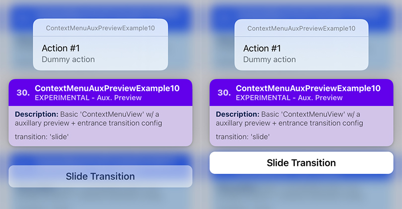
transitionConfigEntrance: {
transition: 'slide',
duration: 0.4,
options: ['curveEaseIn'],
},
}}
renderAuxiliaryPreview={() => (
// ...
)}
>
{/** .... */}
</ContextMenuView>
);
};
ContextMenuView Auxiliary Preview - Example 11
Summary: TBA
| Notes |
|---|
| TBA 📝 Note A: |
// 📝 Note: for the sake of brevity, some of the code is omitted...
export function ContextMenuAuxPreviewExample11(props) {
  return (
    <ContextMenuView
      menuConfig={{
        // ...
      }}
      auxiliaryPreviewConfig={{
        // configure the entrance transition for the aux.
        // preview to use a 'zoom' transition...
        transitionConfigEntrance: {
          transition: 'zoom',
          duration: 0.5,
          options: ['curveEaseOut'],
        },
      }}
      renderAuxiliaryPreview={() => (
        // ...
      )}
    >
      {/** ... */}
    </ContextMenuView>
  );
};

ContextMenuView Auxiliary Preview - Example 12
Summary: TBA
| Notes |
|---|
| TBA 📝 Note A: |
// 📝 Note: for the sake of brevity, some of the code is omitted...
export function ContextMenuAuxPreviewExample12(props) {
return (
<ContextMenuView
menuConfig={{
// ...
}}
auxiliaryPreviewConfig={{
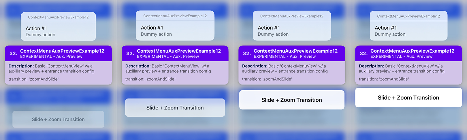
transitionConfigEntrance: {
// configure the entrance transition for the aux.
// preview to use a 'zoom' transition...
transition: 'zoomAndSlide',
duration: 0.4,
options: ['curveEaseInOut'],
// change transition offsets
zoomOffset: 0.2,
slideOffset: 100,
},
}}
renderAuxiliaryPreview={() => (
// ...
)}
>
{/** ... */}
</ContextMenuView>
);
};
ContextMenuView Auxiliary Preview - Example 13
Summary: TBA
| Notes |
|---|
| TBA 📝 Note A: |
// 📝 Note: for the sake of brevity, some of the code is omitted...
export function ContextMenuAuxPreviewExample13(props) {
return (
<ContextMenuView
menuConfig={{
// ...
}}
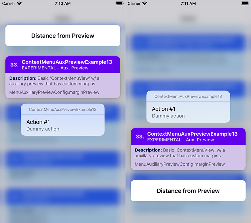
auxiliaryPreviewConfig={{
// Add some space between the aux. preview, and the
// menu preview...
marginPreview: 30,
}}
renderAuxiliaryPreview={() => (
// ...
)}
>
{/** ... */}
</ContextMenuView>
);
};
ContextMenuView Auxiliary Preview - Example 14
Summary: TBA
| Notes |
|---|
| TBA 📝 Note A: |
// 📝 Note: for the sake of brevity, some of the code is omitted...
export function ContextMenuAuxPreviewExample14(props) {
  return (
    <ContextMenuView
      menuConfig={{
        // ...
      }}
      auxiliaryPreviewConfig={{
        // Add some space between the edges of the screen and
        // the aux. preview...
        marginAuxiliaryPreview: 30,
      }}
      renderAuxiliaryPreview={() => (
        // ...
      )}
    >
      {/** ... */}
    </ContextMenuView>
  );
};

ContextMenuView Auxiliary Preview - Example 15
Summary: TBA
| Notes |
|---|
| TBA 📝 Note A: |
// 📝 Note: for the sake of brevity, some of the code is omitted...

export function ContextMenuAuxPreviewExample15(props) {
  return (
    <ContextMenuView
      menuConfig={{
        // ...
      }}
      auxiliaryPreviewConfig={{
        // ...

        // The space between the aux. preview, and the
        // menu preview...
        //
        // A negative value means that you want the aux. preview
        // to appear closer to the menu preview.
        //
        // This is particularly useful if the menu preview is
        // too big, and it causes the menu items to go out of
        // bounds...
        marginPreview: -60,
      }}
      renderAuxiliaryPreview={() => (
        <View style={[styles.auxRootContainer, {
          alignItems: 'center',
          justifyContent: 'center',
        }]}>
          <Text style={styles.textLabel}>
            Aux. Preview
          </Text>
        </View>
      )}
      previewConfig={{
        previewType: 'CUSTOM',
        previewSize: 'STRETCH',
      }}
      renderPreview={() => (
        <View style={[styles.previewRootContainer, {
          alignItems: 'center',
          justifyContent: 'center',
        }]}>
          <Text style={styles.textLabel}>
            Custom Menu Preview
          </Text>
        </View>
      )}
    >
      {/** ... */}
    </ContextMenuView>
  );
};

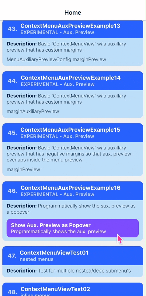
ContextMenuView Auxiliary Preview - Example 16
Summary: Programmatically shows the auxiliary preview as a popover, without showing the context menu.
| Notes |
|---|
| TBA |
// 📝 Note: for the sake of brevity, some of the code is omitted...
export function ContextMenuAuxPreviewExample16(props) {
  const menuRef = React.useRef<ContextMenuView>(null);

  return (
    <ContextMenuView
      ref={menuRef}
      menuConfig={/* ... */}
      auxiliaryPreviewConfig={{
        alignmentHorizontal: 'previewCenter',
        transitionEntranceDelay: 'RECOMMENDED',
        height: 100,
        width: 150,
      }}
      renderAuxiliaryPreview={() => (
        <View style={[styles.auxRootContainer, {
          flex: 1,
          alignItems: 'center',
          justifyContent: 'center',
        }]}>
          <Text style={styles.textLabel}>
            Center
          </Text>
        </View>
      )}
    >
      <ContextMenuCard /* ... */>
        <CardButton
          title={'Show Aux. Preview as Popover'}
          onPress={() => {
            menuRef.current?.showAuxiliaryPreviewAsPopover();
          }}
        />
      </ContextMenuCard>
    </ContextMenuView>
  );
};
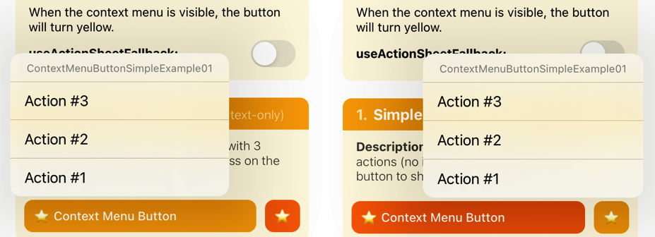
ContextMenuButton Example 01
Summary: TBA
| Notes |
|---|
| TBA 📝 Note A: |
 // 📝 Note: for the sake of brevity, some of the code is omitted...

import { ContextMenuButton } from 'react-native-ios-context-menu';

export function ContextMenuButtonExample01() {
  return (
    <ContextMenuButton
      menuConfig={{
        menuTitle: 'ContextMenuButtonSimpleExample01',
          menuItems: [{
            actionKey  : 'key-01',
            actionTitle: 'Action #1',
          }, {
            actionKey  : 'key-02'   ,
            actionTitle: 'Action #2',
          }, {
            actionKey  : 'key-03'   ,
            actionTitle: 'Action #3',
          }],
      }}
      onPressMenuItem={({nativeEvent}) => {
        Alert.alert(
          'onPressMenuItem Event',
          `actionKey: ${nativeEvent.actionKey} - actionTitle: ${nativeEvent.actionTitle}`
        );
      }}
    >
      {/** Components */}
    </ContextMenuButton>
  );
};
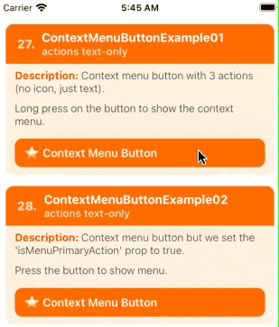
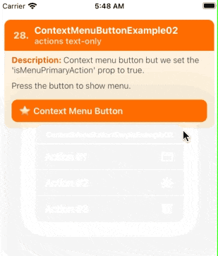
ContextMenuButton Example 02
Summary: TBA
| Notes |
|---|
| TBA 📝 Note A: |
 // 📝 Note: for the sake of brevity, some of the code is omitted...
import { ContextMenuButton } from 'react-native-ios-context-menu';

export function ContextMenuButtonExample02(props) {
  return (
    <ContextMenuButton
      isMenuPrimaryAction={true}
      menuConfig={{
        menuTitle: 'ContextMenuButtonSimpleExample02',
        menuItems: [{
          actionKey  : 'key-01',
          actionTitle: 'Action #1',
          icon: {
            type: 'IMAGE_SYSTEM',
            imageValue: {
              systemName: 'folder',
            },
          }
        }, {
          actionKey  : 'key-02'   ,
          actionTitle: 'Action #2',
          icon: {
            type: 'IMAGE_SYSTEM',
            imageValue: {
              systemName: 'dial.fill',
            },
          }
        }, {
          actionKey  : 'key-03'   ,
          actionTitle: 'Action #3',
          icon: {
            type: 'IMAGE_SYSTEM',
            imageValue: {
              systemName: 'archivebox.fill',
            },
          }
        }],
      }}
      onPressMenuItem={({nativeEvent}) => {
        Alert.alert(
          'onPressMenuItem Event',
          `actionKey: ${nativeEvent.actionKey} - actionTitle: ${nativeEvent.actionTitle}`
        );
      }}
    >
      {/** Components */}
    </ContextMenuButton>
  );
};