| .github/workflows | ||
| android | ||
| assets | ||
| docs | ||
| example | ||
| ios | ||
| scripts | ||
| src | ||
| .editorconfig | ||
| .gitattributes | ||
| .gitignore | ||
| .nvmrc | ||
| .yarnrc | ||
| babel.config.js | ||
| CONTRIBUTING.md | ||
| LICENSE | ||
| package.json | ||
| react-native-ios-context-menu.podspec | ||
| react-native.config.js | ||
| README-old.md | ||
| README.md | ||
| tsconfig.build.json | ||
| tsconfig.json | ||
| yarn.lock | ||

react-native-ios-context-menu

🚧⚠️ Library + Documentation Re-Write WIP ⚠️🚧
📝 Check TODO.md for progress on re-write.
- ❤️ Support the new API's introduced in iOS 15.
- 🧡 New
SFSymbols+ menu icon config API. - 💛 Support for use with Mac Catalyst (e.g. configuring the mac's menu bar + the iPad's shortcuts/menu bar).
- 💚 Typescript re-write (for better autocomplete).
- 💙 Documentation re-write (so its actually usable + better examples).
- 💜 ...and fixing all the bugs + issues so far 😅
- The documentation is incomplete (some parts/sections are marked as TBA i.e. "to be added").
- Some of the links in the documentation are broken (i.e. the URL points to
PLACE_HOLDER_LINK). - For now, please see the Usage And Examples section for information on how to use this library.
| Notice |
|---|
| 📝 Note #1: A future major version of this library will introduce breaking changes to the API (mainly just renaming some of the properties) in order to add new features (and better types). However, the next minor version of this library will not introduce any breaking changes but will instead focus on adding typescript annotations and fixing the existing bugs. |
| 📝 Note #2: The documentation + examples are currently being rewritten. 💅 README-old.md — The old version of the documentation (archived).💖 example/src/examples — The typescript rewrite of the examples (WIP). |
Versions
| Library Version | Compatibility |
|---|---|
1.6.2 |
iOS 10 to iOS 15 Xcode 12+ |
1.4 |
iOS 10 to iOS 15 Xcode 13+ |
1.3 and Below |
iOS 10 to 14 Xcode 12+ |
📝 Note: Supports projects targeting iOS 10 but will use the action sheet fallback when running on iOS 12 and older.
Table of Contents
TOC: Examples Index
A. Introduction
A react native component to use UIMenu on iOS 13 and later.
Gifs and Demos
📝 Note: These gifs are from an older version of the library running on iOS 13 (see Usage And Examples section for updated example gifs).
ContextMenuView Examples, Left: Example 1, Example 2, and Right: Example 3, Example 4

ContextMenuView examples, Left: Example 5, Example 6, and Right: Example 7, Example 8

ContextMenuView example, Left: Example 9, and Right: Example 10

ContextMenuView examples, Left: Example 11, Example 12, and Right: Example 13, Example 14

ContextMenuView examples, Left: Example 15, Example 16, and Right: Example 17, Example 18

ContextMenuView tests, Left: Test 1, and Right: Test 2

ContextMenuView tests, Left: Test 3, and Right: Test 4

ContextMenuView tests, Left: Test 5, and Right: Test 6

ContextMenuView tests, Left/Right: Test 7

ContextMenuView ActionSheetIOS fallback for simple example 1 to 9

ContextMenuView ActionSheetIOS fallback for context menu view test 1 to 6

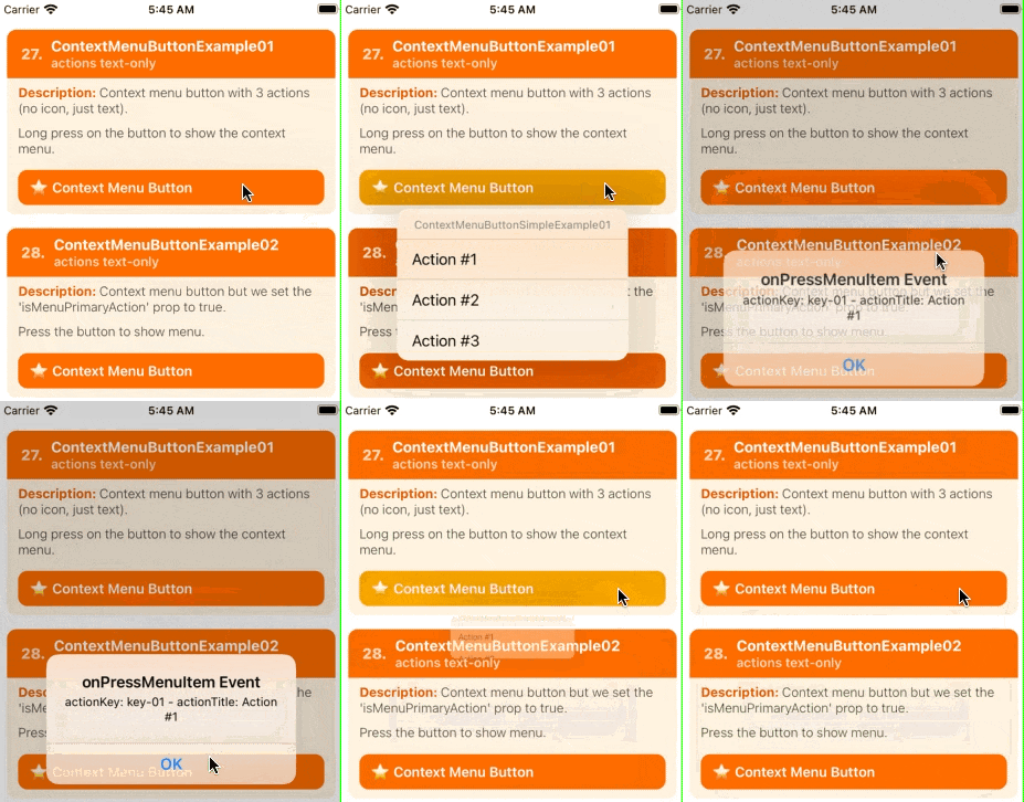
ContextMenuButton examples, Left: Example 1, and Right: Example 2

Features
- Support for creating menu actions and submenus (i.e. nested and in-line menus).
- Support for customizing the menu icons (i.e. support for SF Symbols,
require(image), andxcasseticons, icon tint, etc). - Extensive support for SF Symbols configuration (e.g.
pointSize,weight,scale,hierarchicalColor,paletteColors). - Support for iOS 14 functionality (like the
UIButtoncontext menu, dynamically updating the menu while its visible, etc). - Support for setting (almost) all of the native
UIMenuand UIActionproperties (e.g.UIMenuElementState,MenuElementAtrributes,discoverabilityTitle, etc.) - Basic
ActionSheetIOSmenu fallback for iOS 12 and below. - Support for creating custom context menu previews (with support for dynamic or fixed preview sizes, setting the
UIPreviewParameters, specifying aUITargetedPreview, etc). - Support for custom auxiliary previews (experimental).
- Support for deferred context menu items.
B. Installation
# 1A) install via NPM
npm install react-native-ios-context-menu

# 1B) or install via yarn
yarn add react-native-ios-context-menu

# 2) then run pod install (uses auto-linking)
cd ios && pod install
📝 Note: You will encounter some build errors since this library is written in swift, so there's some extra step involved to use this library (see table below for reference).
| Additional Steps |
|---|
| 1️⃣ Add an empty swift file to your project |
| 2️⃣ Update the project's "Library Search Paths" build settings |
Expo
- ✅ You can use this library with Development Builds. No config plugin is required.
- ❌ This library can't be used in the "Expo Go" app because it requires custom native code.
Troubleshooting
If you encounter any errors/bugs while using this library, or want a particular feature implemented, please create an issue! ✨
Troubleshooting: Xcode Build Error (Swift)
📝 Note: This library is written in swift. If you are having trouble building your app after installing this library, try adding an empty swift file to your project:
- Open up your
ios/project.xcworkspaceproject - On the project navigator panel (located on the right side of Xcode), right click on your project group (or another folder/group i.e the blue or yellow icons) and select the "New File..." option
- In the popup sheet, select "Swift" as the template and then click the "Next" button
- A "Save As" popup sheet should appear and then click "Create" (you can rename the file first if you want to)
- If Xcode asks you to create a "Objective-C Bridging Header" choose "Create Objective-C Bridging Header"
Troubleshooting: Xcode Build Error (Undefined symbol)
When installing this library on Xcode 12+, you'll get the following error in Xcode:

Undefined symbol: (extension in UIKit):
__C.UIMenu.init(title: Swift.String, image: __C.UIImage?, identifier: __C.UIMenuIdentifier?, options: __C.UIMenuOptions, children: [__C.UIMenuElement]) -> __C.UIMenu

Undefined symbol: (extension in UIKit):
__C.UIAction.init(title: Swift.String, image: __C.UIImage?, identifier: __C.UIActionIdentifier?, discoverabilityTitle: Swift.String?, attributes: __C.UIMenuElementAttributes, state: __C.UIMenuElementState, handler: (__C.UIAction) -> ()) -> __C.UIAction
To fix this, see screenshot + follow the steps below:

- Open your
ios/project.xcworkspaceproject. - In the project navigator panel (located on the right side of Xcode), select your project group (i.e. the item with the blueprint icon).
- The Xcode project editor should appear. In the left panel, under the "Project" section, select your project (if it isn't already selected).
- In the project section's top tab bar, select the "Build Settings" tab (also make sure the "All" and "Combined" tabs are selected).
- In the project navigator list, under the "Search Path" section, there should be a "Library Search Paths" setting (alternatively, you can search for "Library Search Paths" in the search bar).
- According to this issue comment, you can clear all the items listed in the "Library Search Paths" setting by selecting the items in the list, and pressing the "-" button in the popover.
- TLDR: Xcode automatically manages this setting, and the RN template hardcodes it to use Swift 5.0.
- Alternatively, you can change the entry
"$(TOOLCHAIN_DIR)/usr/lib/swift-5.0/$(PLATFORM_NAME)"to"$(TOOLCHAIN_DIR)/usr/lib/swift-5.3/$(PLATFORM_NAME)"i.e. changeswift-5.0toswift-5.3, or whatever the newest version of swift that comes with your Xcode installation (to show the popup dialog, double click the value/item).
- If you haven't already, make sure to create an empty swift file. Then clean the build folder (the option is in the menu bar under: "Product" -> "Clean Build Folder") and try building your project again.
- If you are still having problems building the app, try the following and build your project again:
- Try clearing out Xcode's
derivedDatadirectory:rm -rf ~/Library/Developer/Xcode/DerivedData/*(check out this gist for instructions on how to clean up Xcode) - Try clearing out the
Cocoapodscache:rm -rf "${HOME}/Library/Caches/CocoaPods"(and then try runningpod installagain).

Explanation: Some versions of the react-native template hard codes the swift library search paths to use swift 5.0 (which causes the linker to mismatch the swift system libraries bundled with your Xcode + iOS/Simulator installation).
Here are some related issues in the RN repo: Issue 30202 and Issue 29178.
C. Basic Usage
For more examples, check out the Usage And Examples section.
import * as React from 'react';
import { StyleSheet, Text } from 'react-native';

import { ContextMenuView } from 'react-native-ios-context-menu';

export function BasicUsageExample01() {
  return (
    <ContextMenuView
      style={styles.container}
      menuConfig={{
        menuTitle: 'BasicUsageExample01',
        menuItems: [{
          actionKey  : 'key-01',
          actionTitle: 'Action #1',
        }, {
          actionKey  : 'key-02'   ,
          actionTitle: 'Action #2',
        }, {
          actionKey  : 'key-03'   ,
          actionTitle: 'Action #3',
        }],
      }}
    >
      <Text style={styles.text}>
        Press And Hold To Show Context Menu
      </Text>
    </ContextMenuView>
  );
};

const styles = StyleSheet.create({
  container: {
    margin: 10,
    padding: 10,
  },
  text: {
    fontSize: 16,
  },
});
D. Documentation
💡 Tip: Most of the time, when a type or component is mentioned, you can click it to jump to that item in the README (or its declaration in the source code).
D.1. Components
ContextMenuView Component
ContextMenuView Component: Props
| Prop Name and Type | Description |
|---|---|
⚛️ ViewProps |
This component supports all the standard props from a <View/> component. |
🔤 menuConfig⚛️ MenuConfig |
This prop configures the context menu, along with what menu actions to show. This prop accepts a MenuConfig object. This object is used to configure various aspects of the context menu. Here are some relevant properties:1️⃣ MenuConfig.menuTitle: the context menu title (required) — if you don't want to show the menu title, pass in an empty string.2️⃣ MenuConfig.menuItems: the actions to show (e.g. the title, icons, subtitle, etc) — accepts either an array of MenuActionConfig or MenuConfig objects.3️⃣ MenuConfig.menuOptions: the attributes of the context menu (e.g. destructive) — accepts an array of UIMenuOptions string items, and any nested menus or submenus to show (see "Note A"). 📝 Note A: Passing a MenuConfig object inside of the MenuConfig.menuItems property will result in a nested context menu (i.e. a submenu).In this scenario, the MenuConfig.menuOptions and MenuConfig.icon can be used to configure the appearance of the submenu.For usage examples regarding nested menus, see Example 06. 📝 Note B: Passing a value of null (or undefined) to this prop will not disable the context menu. Instead, please use the isContextMenuEnabled prop to disable the context menu. 📝 Note C: You can put MenuConfig in state if you want to dynamically change the menu configuration (this will allow you to add/remove submenu items, or update the current menu options).If the context menu is currently visible, changing/updating the MenuConfig value passed to this prop will cause the context menu to change in real-time. This behavior is only supported on iOS 14+.📌 Some example links to get you started: • For basic usage examples regarding MenuConfig, see: Example 1,• For examples on creating + configuring the menu action items (i.e MenuActionConfig), see: Example 2,• For menu action attributes + menu state, and action subtitles, see: Example 4, Example 8, and Example 13, • For examples regarding the usage of icons (i.e ImageItemConfig), see: Example 16, Example 17, and Example 18. |
🔤 previewConfig⚛️ MenuPreviewConfig |
Configures the context menu's preview. If no configuration is provided then it will default to using the context menu component itself as the preview. 📝 Note: If you do not want to show a preview (i.e. only show the context menu itself), consider using a ContextMenuButton component instead.📌 Some example links to get you started: • For examples regarding the configuration of the context menu preview (e.g. custom previews), see: Example 11, Example 12, Example 14, and Example 15. |
🔤 shouldUseDiscoverabilityTitleAsFallbackValueForSubtitle⚛️ boolean✳️ Default: true |
On iOS 15+, the value passed to the MenuActionConfig.discoverabilityTitle property is no longer displayed as a subtitle under the menu action.Instead you need to set a different property called MenuActionConfig.subtitle.The discoverabilityTitle property is now used for the "discoverability heads-up display" (e.g when an app supports keyboard shortcuts, holding down the command key presents a list of shortcuts; the discoverabilityTitle is then used as the title for the shortcut).If this prop is set to true, it will then uses the value passed on to the discoverabilityTitle value as the subtitle for the menu action, preserving the old behavior. In other words, this prop exists for backwards-compatibility reasons.📝 Note: This prop is set to true by default; set this to false if you don't want this automatic behaviour to happen. |
🔤 shouldWaitForMenuToHideBeforeFiringOnPressMenuItem⚛️ boolean✳️ Default: true |
If set to true (which it is by default), the onPressMenuItem event will be triggered after the context menu has been hidden (i.e. after onMenuDidHide event is triggered).Set this to false if you want onPressMenuItem to trigger as soon as an item has been pressed in the context menu.📝 Note: Layout updates while the context menu is transitioning from it's open to hidden state might cause layout flickering (e.g. Issue #43). |
🔤 isContextMenuEnabled⚛️ boolean✳️ Default: true |
Enables or disables the context menu. Useful if you want to temporarily disable the context menu. |
🔤 lazyPreview⚛️ boolean✳️ Default: true |
If set to true (which it is by default), the custom context menu preview (i.e. the component returned from the ContextMenuView.renderPreview prop) will only be mounted/rendered when the context menu interaction begins (i.e. when the context menu is about to be shown).Set this to false if you want the preview content to be always mounted. |
🔤 useActionSheetFallback⚛️ boolean✳️ Default: true |
Context menus are only supported on iOS 13+ (i.e context menus are not supported on iOS 12, and below). On iOS 12 and below, a long press on a ContextMenuView will show a ActionSheetIOS menu based on the current menuConfig prop.If you want to disable this behavior, set this prop to false. 📝 Note: Default value is false on iOS 13+, and true on iOS 12 and below. |
🔤 renderPreview⚛️ () => React.ReactElement |
This prop is a "render" prop, i.e it accepts a function that returns a react component. The returned component will displayed in the context menu preview. |
🔤 isAuxiliaryPreviewEnabled⚛️ boolean✳️ Default: false |
⚠️ Experimental: Please see Auxiliary Preview section. TBA |
🔤 auxiliaryPreviewConfig⚛️ MenuAuxiliaryPreviewConfig |
⚠️ Experimental: Please see Auxiliary Preview section. TBA |
🔤 renderAuxillaryPreview⚛️ () => React.ReactElement |
⚠️ Experimental: Please see Auxiliary Preview section. TBA |
ContextMenuView Component: Event Props
| Prop Name and Type | Description |
|---|---|
🔤 onMenuWillShow⚛️ OnMenuWillShowEvent |
Event that gets called before the context menu is shown, i.e this event is immediately invoked when the menu is about to become visible. |
🔤 onMenuDidShow⚛️ OnMenuDidShowEvent |
Event that gets called after the context menu is shown, i.e this event is invoked after the menu entrance animation is finished. |
🔤 onMenuWillHide⚛️ OnMenuWillHideEvent |
Event that gets called before the context menu is hidden, i.e this event is immediately invoked when the menu is about to become hidden. |
🔤 onMenuDidHide⚛️ OnMenuDidHideEvent |
Event that gets called after the context menu is hidden, i.e this event is invoked after the menu exit animation is finished. |
🔤 onMenuWillCancel⚛️ OnMenuWillCancelEvent |
Event that gets called when the menu is cancelled and about to be hidden, i.e this event is immediately invoked when the context menu interaction is cancelled. |
🔤 onMenuDidCancel⚛️ OnMenuDidCancelEvent |
Event that gets called when the menu is cancelled and hidden, i.e. this event is invoked when the context menu is cancelled, and the menu exit transition is finished. |
🔤 onPressMenuItem⚛️ OnPressMenuItemEvent |
Event that gets called when a menu action is pressed. You can identify which action was pressed via nativeEvent.actionKey property in the nativeEvent object. Check out Example 1, and Example 9 for examples regarding the onPressMenuItem event prop.📝 Note: If shouldWaitForMenuToHideBeforeFiringOnPressMenuItem prop is set to true (which it is by default), then this event will fire after onMenuDidHide is triggered. |
🔤 onPressMenuPreview⚛️ OnPressMenuPreviewEvent |
Event that gets called when the menu's preview is pressed. |
🔤 onMenuAuxiliaryPreviewWillShow⚛️ OnMenuAuxiliaryPreviewWillShowEvent |
⚠️ Experimental: Please see Auxiliary Preview section. TBA |
🔤 onMenuAuxiliaryPreviewDidShow⚛️ OnMenuAuxiliaryPreviewDidShowEvent |
⚠️ Experimental: Please see Auxiliary Preview section. TBA |
🔤 onMenuAuxiliaryPreviewDidShow⚛️ DeferredElementProvider i.e. (deferredID, completion) => void |
This event gets called whenever a UIDeferredMenuElement needs to be loaded. A deferred menu element can be created via a DeferredMenuElementConfig object.A deferred menu is a context menu is basically a placeholder — i.e. it appears as a loading indicator in the context menu. When you pass in a DeferredMenuElementConfig object to MenuConfig.menuItems, it means you want to load and add additional menu items once the context menu is opened.This event will provide a completion callback — use this to provide the additional context menu items you want to load.📝 Note A: Deferred menu elements only work on iOS 14+. 📝 Note B: You can dynamically update the context menu items without using the prop — the difference is that deferred menu items will show a placeholder loading indicator when the additional menu items haven't been loaded yet. 📝 Note C: It is possible to have multiple deferred menu elements (e.g. deferred elements can also provide deferred elements, and so on). Just be sure to use a unique deferredID so you can tell them apart.📌 Example Usage: • ContextMenuViewExample19. |
ContextMenuView Component: Properties/Methods
| Prop Name and Type | Description |
|---|---|
🔤 dismissMenu⚛️ Promise<Void> |
Allows you to programmatically dismiss the context menu. Only available on iOS 14 and above. |
ContextMenuView Component: Experimental - Auxiliary Preview
The context menu auxiliary preview is an experimental feature, and is not officially part of UIKit's "Menu and Shortcuts" API.
This is just a feature that I've implemented myself and added to the library — as such official support is limited and might break in a future iOS version. Please use at your own risk.
ContextMenuButton Component
For basic usage, please see Example 1 section.
-
The
ContextMenuButtoncomponent is almost the same as theContextMenuViewcomponent (It supports the same kind of props and events). -
The only difference between them is that the
ContextMenuButtoncomponent does not have a preview, and it can be immediately shown when its tapped instead of having to do a long press. See Example 2 for more details. -
Note that
ContextMenuButtonis only available on iOS 14 and above. On iOS 13, it will use aContextMenuButton, and on iOS 12 and below, it will use theActionSheetFallbackmodule to present aActionSheetIOSmenu. -
If you want to add additional touch events, you can wrap this component inside a button component (e.g.
TouchableOpacity).- When wrapping this component inside a button, please make sure to set the
useActionSheetFallbackprop tofalse.
- When wrapping this component inside a button, please make sure to set the
ContextMenuButton Component: Props
| Prop Name and Type | Description |
|---|---|
⚛️ ViewProps |
This component supports all the standard props from a <View/> component. |
🔤 menuConfig⚛️ MenuConfig |
Same as ContextMenuView.menuConfig prop. |
🔤 isMenuPrimaryAction⚛️ boolean |
When set to true, the context menu will be shown when its tapped instead of a long press. |
🔤 shouldUseDiscoverabilityTitleAsFallbackValueForSubtitle⚛️ boolean✳️ Default: true |
TBA / Not Implented |
🔤 enableContextMenu⚛️ boolean✳️ Default: true |
Same as ContextMenuView.enableContextMenu prop. |
🔤 useActionSheetFallback⚛️ boolean✳️ Default: true |
Same as ContextMenuView.useActionSheetFallback prop. |
ContextMenuButton Component: Event Props
| Prop Name and Type | Description |
|---|---|
🔤 onMenuWillShow⚛️ OnMenuWillShowEvent |
Same as ContextMenuView.onMenuWillShow event. |
🔤 onMenuDidShow⚛️ OnMenuDidShowEvent |
Same as ContextMenuView.onMenuDidShow event. |
🔤 onMenuWillHide⚛️ OnMenuWillHideEvent |
Same as ContextMenuView.onMenuWillHide event. |
🔤 onMenuDidHide⚛️ OnMenuDidHideEvent |
Same as ContextMenuView.onMenuDidHide event. |
🔤 onMenuWillCancel⚛️ OnMenuWillCancelEvent |
Same as ContextMenuView.onMenuWillCancel event. |
🔤 onMenuDidCancel⚛️ OnMenuDidCancelEvent |
Same as ContextMenuView.onMenuDidCancel event. |
🔤 onMenuWillCreate⚛️ OnMenuWillCreateEvent |
Same as ContextMenuView.onMenuWillCreate event. |
🔤 onPressMenuItem⚛️ OnPressMenuItemEvent |
Same as ContextMenuView.onPressMenuItem event. |
ContextMenuButton Component: Properties/Methods
| Prop Name and Type | Description |
|---|---|
🔤 dismissMenu⚛️ Promise<Void> |
Same as ContextMenuView.dismissMenu method. |
ActionSheetFallback Module
A module to show a ActionSheetIOS menu based on a MenuConfig object.
This module attempts to approximate UIMenu behavior using ActionSheetIOS, so it's very limited (i.e. it does not support menu/action icons, etc.), but it does support things like submenu's, destructive actions/menu's, inline submenu's, and hidden actions.
-
Import the module like this:
import { ActionSheetFallback } from "react-native-ios-context-menu"; -
To present a 
ActionSheetIOSmenu, callconst selectedAction = await ActionSheetFallback.show(menuConfig)
| Function | Description |
|---|---|
🔤 show ⚛️ (menuConfig: MenuConfig):Promise<MenuAction ¦ null> |
This function accepts a MenuConfig object and returns the selected MenuAction object or null if cancelled. |
D.2. Context
ContextMenuViewContext Context
TBA
| Property | Description |
|---|---|
🔤 isMenuVisible⚛️ boolean |
TBA |
🔤 getRefToContextMenuView⚛️ () => ContextMenuView📌 ContextMenuView |
TBA |
ContextMenuButtonContext Context
TBA
| Property | Description |
|---|---|
🔤 isMenuVisible⚛️ boolean |
TBA |
🔤 getRefToContextMenuButton⚛️ () => ContextMenuView📌 ContextMenuButton |
TBA |
D.3. Hooks
useMenuContext Hook
A hook to use the ContextMenuViewContext context.
TBA
useMenuButtonContext Hook
A hook to use the ContextMenuButtonContext context.
TBA
D.4. Objects and Types
MenuConfig.ts
- 📌 Declaration:
MenuConfig.ts
Object Type: MenuConfig
A container for grouping related menu elements in an app menu or contextual menu.
An object that is used to create and configure a context menu. Internally, this object is used to create a UIMenu instance (see apple docs for more information).
| Name and Type | Description |
|---|---|
🔤 type⚛️ string, i.e"menu" |
TBA |
🔤 menuTitle⚛️ string |
TBA 📝 Note: If you don't want a menu title to appear for your context menu, just pass in an empty string to this property. |
🔤 menuOptions⚛️ Array<UIMenuOptions>📌 UIMenuOptions |
TBA |
🔤 menuItems⚛️ MenuElementConfig[] i.e. MenuConfig ¦ MenuActionConfig¦ DeferredMenuElementConfig📌 MenuConfig📌 MenuActionConfig📌 DeferredMenuElementConfig |
TBA |
🔤 icon⚛️ IconConfig ¦ ImageItemConfig📌 IconConfig (deprecated)📌 ImageItemConfig |
TBA |
Object Type: MenuActionConfig
An object that is used to create a menu action item in the context menu. Internally, this object is used to create a UIAction instance (see apple docs for more information),
| Name and Type | Description |
|---|---|
🔤 type⚛️ string, i.e "action" |
TBA |
🔤 Required: actionKey⚛️ string |
TBA |
🔤 Required: actionTitle⚛️ string |
TBA |
🔤 actionSubtitle⚛️ string |
TBA |
🔤 menuState⚛️ MenuState |
TBA |
🔤 menuAttributes⚛️ Array<MenuAttributes>📌 MenuAtrributes |
TBA |
🔤 discoverabilityTitle⚛️ string |
TBA |
🔤 icon⚛️ IconConfig ¦ ImageItemConfig📌 IconConfig (deprecated)📌 ImageItemConfig |
TBA |
Object Type: DeferredMenuElementConfig
An object that is used to create a deferred menu element. Internally, this object is used to create a UIDeferredMenuElement instance (see apple docs for more information),
| Name and Type | Description |
|---|---|
🔤 Required: type⚛️ string i.e. deferred. |
TBA |
🔤 Required: deferredID⚛️ string |
TBA |
🔤: shouldCache⚛️ boolean |
TBA |
String Union: MenuAttributes
Attributes that determine the style of the menu element.
A union string type that maps to UIMenuElement.Attributes enum (see apple docs for more information).
| Type | Description |
|---|---|
⚛️ hidden |
TBA |
⚛️ disabled |
TBA |
⚛️ destructive |
TBA |
String Union: MenuState
Constants that indicate the state of an action- or command-based menu element.
A union string type that maps to UIMenuElement.State enum (see apple docs for more information).
| Type | Description |
|---|---|
⚛️ on |
TBA |
⚛️ off |
TBA |
⚛️ mixed |
TBA |
String Union: UIMenuOptions
Options for configuring a menu's appearance.
A union string type that maps to UIMenu.Options option set (see apple docs for more information).
| Type | Description |
|---|---|
⚛️ destructive |
TBA |
⚛️ displayInline |
TBA |
MenuPreviewConfig.ts
- 📌 Declaration:
MenuPreviewConfig.ts
Object Type: MenuPreviewConfig
| Name and Type | Description |
|---|---|
🔤 previewType⚛️ MenuPreviewType✳️ Default: DEFAULT |
TBA |
🔤 previewSize⚛️ MenuPreviewSize✳️ Default: INHERIT |
TBA |
🔤 isResizeAnimated⚛️ boolean✳️ Default: true |
TBA |
🔤 borderRadius⚛️ number |
TBA |
🔤 backgroundColor⚛️ DynamicColor ¦ string📌 DynamicColor |
TBA |
🔤 previewSize⚛️ ContextMenuInteractionCommitStyle✳️ Default: dismiss |
TBA |
🔤 targetViewNode⚛️ number |
TBA |
String Union: ContextMenuInteractionCommitStyle
| Name and Type | Description |
|---|---|
⚛️ dismiss |
TBA |
⚛️ pop |
TBA |
String Union: MenuPreviewSize
| Name and Type | Description |
|---|---|
⚛️ INHERIT |
TBA |
⚛️ STRETCH |
TBA |
String Union: MenuPreviewType
| Name and Type | Description |
|---|---|
⚛️ DEFAULT |
TBA |
⚛️ CUSTOM |
TBA |
MenuAuxiliaryPreviewConfig.ts
- 📌 Declaration:
MenuAuxiliaryPreviewConfig.ts
Object Type: MenuAuxiliaryPreviewConfig
| Name and Type | Description |
|---|---|
🔤 height⚛️ number |
TBA |
🔤 anchorPosition⚛️ MenuAuxiliaryPreviewAnchorPosition✳️ Default: automatic |
TBA |
🔤 alignmentHorizontal⚛️ MenuAuxiliaryPreviewHorizontalAlignment✳️ Default: stretchPreview |
TBA |
🔤 marginPreview⚛️ number |
TBA |
🔤 marginAuxiliaryPreview⚛️ number |
TBA |
🔤 transitionConfigEntrance⚛️ MenuAuxiliaryPreviewTransitionConfig |
TBA |
🔤 transitionEntranceDelay⚛️ MenuAuxiliaryPreviewTransitionEntranceDelay |
TBA |
String Union Type: MenuAuxiliaryPreviewAnchorPosition
| Name and Type | Description |
|---|---|
⚛️ top |
TBA |
⚛️ bottom |
TBA |
⚛️ automatic |
TBA |
String Union Type: MenuAuxiliaryPreviewHorizontalAlignment
| Name and Type | Description |
|---|---|
⚛️ stretchScreen |
TBA |
⚛️ stretchPreview |
TBA |
⚛️ previewLeading |
TBA |
⚛️ previewTrailing |
TBA |
⚛️ previewCenter |
TBA |
String Union Type: UIViewAnimateOptions
| Name and Type | Description |
|---|---|
⚛️ curveEaseIn |
TBA |
⚛️ curveEaseOut |
TBA |
⚛️ curveEaseInOut |
TBA |
⚛️ curveLinear |
TBA |
Object Type: UIViewAnimateConfig
| Name and Type | Description |
|---|---|
🔤 duration⚛️ number |
TBA |
🔤 delay⚛️ number |
TBA |
🔤 options⚛️ UIViewAnimateOptions[] |
TBA |
Object Type: MenuAuxiliaryPreviewBaseTransitionConfig
This type is an object tagged union type, with the transition property being the tag that separates the unions.
The table below defines the possible valid values that can be assigned to the type property (the subsequent tables are the different possible unions).
| Name and Type | Description |
|---|---|
🔤 transition ⚛️ string i.e. 'none' ¦ 'fade''slide' ¦ 'zoom' ¦ 'zoomAndSlide' |
TBA |
| Name and Type | Description |
|---|---|
🔤 transition⚛️ string i.e. none |
TBA |
| Name and Type | Description |
|---|---|
🔤 transition⚛️ string i.e. fade |
TBA |
| Name and Type | Description |
|---|---|
🔤 transition⚛️ string i.e. slide |
TBA |
🔤 slideOffset⚛️ number |
TBA |
| Name and Type | Description |
|---|---|
🔤 transition⚛️ string i.e. zoom |
TBA |
🔤 zoomOffset⚛️ number |
TBA |
| Name and Type | Description |
|---|---|
🔤 transition⚛️ string i.e. zoomAndSlide |
TBA |
🔤 slideOffset⚛️ number |
TBA |
🔤 zoomOffset⚛️ number |
TBA |
Object Union Type: `MenuAuxiliaryPreviewTransitionConfig
This type is a union between the UIViewAnimateConfig object type, and the MenuAuxiliaryPreviewBaseTransitionConfig object type.
export type MenuAuxiliaryPreviewTransitionConfig =
  | UIViewAnimateConfig
  | MenuAuxiliaryPreviewBaseTransitionConfig;
Mixed Union Type: MenuAuxiliaryPreviewTransitionEntranceDelay.
| Name and Type | Description |
|---|---|
⚛️ number |
TBA |
⚛️ RECOMMENDED |
TBA |
⚛️ AFTER_PREVIEW |
TBA |
MenuIconConfig.ts
- 📌 Declaration:
MenuIconConfig.ts
Object Type: IconConfig
This has been deprecated and will be removed in a future version. Use ImageItemConfig instead. For documentation regarding IconConfig, please see the documentation in the old README.
ImageItemConfig.ts
- 📌 Declaration:
ImageItemConfig.ts
Object Type: ImageItemConfig
This type is an object tagged union type, with the type property being the tag that separates the unions. The table below defines the possible valid values that can be assigned to the type property.
| Name and Type | Description |
|---|---|
🔤 Required: type⚛️ ImageItemConfigType string union, i.e 'IMAGE_ASSET' ¦ 'IMAGE_SYSTEM' ¦ 'IMAGE_REQUIRE' ¦ 'IMAGE_EMPTY' ¦ 'IMAGE_RECT' ¦ 'IMAGE_GRADIENT' |
TBA |
ImageItemConfig: IMAGE_ASSET
| Name and Type | Description |
|---|---|
🔤 Required: type⚛️ string i.e 'IMAGE_ASSET' |
TBA 📌 Maps to UIImage.init(named:) constructor in the apple docs. |
🔤 Required: imageValue⚛️ string |
TBA |
🔤 imageOptions?⚛️ UIImageConfig |
TBA |
ImageItemConfig: IMAGE_SYSTEM
| Name and Type | Description |
|---|---|
🔤 Required: type⚛️ string i.e 'IMAGE_SYSTEM' |
TBA 📌 Maps to UIImage.init(systemName:withConfiguration:) constructor in the apple docs. |
🔤 Required: imageValue⚛️ ImageSystemConfig |
TBA 📌 Maps to the withConfiguration argument label in the UIImage.init(systemName:withConfiguration:) constructor in the apple docs. |
🔤 imageOptions?⚛️ UIImageConfig |
TBA |
ImageItemConfig: IMAGE_EMPTY
| Name and Type | Description |
|---|---|
🔤 Required: type⚛️ string i.e 'IMAGE_EMPTY' |
TBA |
ImageItemConfig: IMAGE_RECT
| Name and Type | Description |
|---|---|
🔤 Required: type⚛️ string i.e 'IMAGE_RECT' |
TBA 📝 Note: Programmatically creates an image using UIGraphicsImageRenderer. |
🔤 Required: imageValue⚛️ ImageRectConfig |
TBA |
ImageItemConfig: IMAGE_GRADIENT
| Name and Type | Description |
|---|---|
🔤 Required: type⚛️ string i.e 'IMAGE_GRADIENT' |
TBA 📝 Note: Programmatically creates an image using UIGraphicsImageRenderer. |
🔤 imageValue⚛️ ImageGradientConfig |
TBA |
Object Type: ImageResolvedAssetSource
TBA
| Name and Type | Description |
|---|---|
🔤 height⚛️ number |
TBA |
🔤 width⚛️ number |
TBA |
🔤 scale⚛️ number |
TBA |
🔤 uri⚛️ string |
TBA |
Object Type: ImageRectConfig
TBA
| Name and Type | Description |
|---|---|
🔤 Required: width⚛️ number |
TBA |
🔤 Required: height⚛️ number |
TBA |
🔤 Required: fillColor⚛️ string |
TBA |
🔤 borderRadius?⚛️ number |
TBA |
Object Type: ImageGradientConfig
TBA
| Name and Type | Description |
|---|---|
🔤 Required: width⚛️ number |
TBA |
🔤 Required: height⚛️ number |
TBA |
🔤 borderRadius?⚛️ number |
TBA |
🔤 Required: colors⚛️ Array<string> |
TBA 📌 Maps to CAGradientLayer.colors property in the apple docs. |
🔤 locations?⚛️ Array<number> |
TBA 📌 Maps to CAGradientLayer.locations property in the apple docs. |
🔤 startPoint?⚛️ Point ¦ PointPreset📌 Point📌 PointPreset |
TBA 📌 Maps to CAGradientLayer.startPoint property in the apple docs. |
🔤 endPoint?⚛️ Point ¦ PointPreset📌 Point📌 PointPreset |
TBA 📌 Maps to CAGradientLayer.endPoint property in the apple docs. |
🔤 type?⚛️ string i.e 'axial' ¦ 'conic' ¦ 'radial' |
TBA 📌 Maps to CAGradientLayer.type property in the apple docs. |
Object Type: ImageSystemConfig
TBA
| Name and Type | Description |
|---|---|
🔤 Required: systemName⚛️ string |
TBA 📌 Maps to the systemName argument label in the UIImage.init(systemName:withConfiguration:) constructor in the apple docs. |
🔤 pointSize?⚛️ number |
TBA 📌 Maps to UIImage.SymbolConfiguration.init(pointSize:) constructor in the apple docs. |
🔤 weight?⚛️ ImageSymbolWeight |
TBA 📌 Maps to UIImage.SymbolConfiguration.init(weight:) constructor in the apple docs. |
🔤 scale?⚛️ ImageSymbolScale |
TBA 📌 Maps to UIImage.SymbolConfiguration.init(scale:) constructor in the apple docs. |
🔤 hierarchicalColor?⚛️ Array<string> |
TBA 📝 Note A: Cannot be used at the same time with paletteColors (it's either one or the other).📝 Note B: Requires iOS 15+. 📌 Maps to UIImage.SymbolConfiguration.init(hierarchicalColor:) constructor in the apple docs. |
🔤 paletteColors?⚛️ string |
TBA 📝 Note A: Cannot be used at the same time with hierarchicalColor (it's either one or the other).📝 Note B: Requires iOS 15+. 📌 Maps to UIImage.SymbolConfiguration.init(paletteColors:) constructor in the apple docs. |
Undocumented Types
TBA
| Type | Description |
|---|---|
📌 Declaration: MenuEvents |
This file contains all the menu-related events and event objects. |
📌 Declaration: MiscTypes.ts |
This file contains a bunch of types that haven't been categorized yet. Contains: PointPreset, Point, DynamicColor, etc. |
D.5. Constants
Object: LIB_ENV
TBA
| Type | Description |
|---|---|
🔤 isContextMenuButtonSupported⚛️ boolean |
TBA |
🔤 isContextMenuViewSupported⚛️ boolean |
TBA |
E. Usage And Examples
ContextMenuView Example 01
Summary: A basic context menu that has 3 menu action items (e.g. "Action #1", "Action #2", and "Action #3").
| Notes |
|---|
1️⃣ — The ContextMenuView.menuConfig prop accepts an optional MenuConfig object. This object will be used to create and configure the context menu. |
2️⃣ — You can set the context menu title via passing a string value to the MenuConfig.menuTitle property.📝 Note: You can pass an empty string if you don't want a context menu title to appear. |
3️⃣ — To populate the context menu with items, you can pass a MenuActionConfig object in the MenuConfig.menuItems property.📝 Note A: The MenuConfig.menuItems property can accept an array of a MenuElementConfig union type.To be more specific, the menuItems property can accept an array containing any of the following object types: MenuConfig object, MenuActionConfig, and DeferredMenuElementConfig.📝 Note B: If you pass in a MenuActionConfig object in the MenuConfig.menuItems property, it means that you want to create a context menu action.📝 Note C: If you pass in a MenuConfig object in the MenuConfig.menuItems property, it means that you want to create a submenu.📝 Note D: If you pass in a DeferredMenuElementConfig object in the MenuConfig.menuItems property, it means that you want to create a deferred menu item (i.e. a menu item that has a loading indicator). |
4️⃣ — A MenuActionConfig object represents an action item in the context menu (e.g. copy, paste, delete, etc).As such, if you pass in a MenuActionConfig object to MenuConfig.menuItems, it means that you want to create a context menu action.📝 Note A: The MenuActionConfig.actionKey property serves as a unique identifier for your menu action. If you have multiple menu actions, the actionKey will help you differentiate them.📝 Note B: You will receive the value you passed in MenuActionConfig.actionKey in the ContextMenuView.onPressMenuItem event (i.e. via the nativeEvent object).In other words, the actionKey allows you to identify which menu action item was selected/pressed. For a more detailed example regarding the onPressMenuItem event, see: ContextMenuView Example 09.📝 Note C: Make sure that the actionKey is unique for each instance of the ContextMenuView component. |
5️⃣ — You can use the ContextMenuView.onPressMenuItem event prop to get notified whenever a menu action item has been selected.The function you pass to the onPressMenuItem prop will receive a OnPressMenuItemEventObject object.📝 Note A: Details about the selected menu action item can be accessed via the OnPressMenuItemEventObject.nativeEvent object.E.g. OnPressMenuItemEventObject.nativeEvent.actionKey.📝 Note B: If ContextMenuView.shouldWaitForMenuToHideBeforeFiringOnPressMenuItem prop is set to true (which it is by default), then this event will fire after onMenuDidHide is triggered. |
// 📝 Note: for the sake of brevity, some of the code is omitted...
import { ContextMenuView } from 'react-native-ios-context-menu';

export function ContextMenuViewExample01(props) {
  return (
    <ContextMenuView
      menuConfig={{
        // Note: If you don't want a menu title to appear for your
        // context menu, you can just pass in an empty string
        menuTitle: 'ContextMenuViewExample01',
        menuItems: [{
          actionKey  : 'key-01',
          actionTitle: 'Action #1',
        }, {
          actionKey  : 'key-02'   ,
          actionTitle: 'Action #2',
        }, {
          actionKey  : 'key-03'   ,
          actionTitle: 'Action #3',
        }],
      }}
      onPressMenuItem={({nativeEvent}) => {
        Alert.alert(
          'onPressMenuItem Event',
          `actionKey: ${nativeEvent.actionKey} - actionTitle: ${nativeEvent.actionTitle}`
        );
      }}
    >
      {/** Components */}
    </ContextMenuView>
  );
};


ContextMenuView Example 02
Summary: A basic context menu that has 3 menu action items, each with a different "SF Symbols" icon. This examples shows how to add a system icon in the context menu action.
| Notes |
|---|
1️⃣ — A MenuActionConfig object can be configured to show an icon via the MenuActionConfig.icon property.📝 Note A: The icon property accepts a ImageItemConfig object.📝 Note B: A ImageItemConfig object is used to describe images/assets (e.g. SF Symbols icons, images, xcasset images, programmatic images, etc). |
| 2️⃣ — In this example, we want to use a "SF Symbols" icon for the menu action. In order to do this, the ImageItemConfig.type property must be set to "IMAGE_SYSTEM".📝 Note A: Passing in a value of "IMAGE_SYSTEM" to the type property means that we want to create a "SF Symbols" system icon.📝 Note B: Using a "SF Symbols" icon requires iOS 13+. 📝 Note C: Via the ImageItemConfig object, you can also configure the context menu action to use other icons (e.g. xcasset items, images, gradients, solid colors, etc).📝 Note D: You can apply a tint to the icon via the ImageItemConfig.imageOptions property using the UIImageConfig.tint and UIImageConfig.renderingMode property. |
3️⃣ — In order to configure what kind of "SF Symbols" icon we want to use for the menu action, we need to pass in a ImageSystemConfig object to the ImageItemConfig.imageValue property.We can set what kind of icon to use via passing a string value to the ImageSystemConfig.systemName property.📝 Note A: The string value passed to the systemName property must be a valid SF Symbols name.📝 Note B: To view the list of SF Symbols icons (along with their corresponding icon names), you'll need to download the SF Symbols Mac app from this page. 📝 Note C: You can customize the "SF Symbols" icon further via the ImageItemConfig (e.g. pointSize, weight, scale, hierarchicalColor, paletteColors, etc). |
// 📝 Note: for the sake of brevity, some of the code is omitted...
import { ContextMenuView } from 'react-native-ios-context-menu';

export function ContextMenuViewExample02(props) {
  return (
    <ContextMenuView
      menuConfig={{
          menuTitle: 'ContextMenuViewExample02',
          menuItems: [{
            actionKey  : 'key-01',
            actionTitle: 'Action #1',
            icon: {
              type: 'IMAGE_SYSTEM',
              imageValue: {
                systemName: 'folder',
              },
            }
          }, {
            actionKey  : 'key-02'   ,
            actionTitle: 'Action #2',
            icon: {
              type: 'IMAGE_SYSTEM',
              imageValue: {
                systemName: 'dial.fill',
              },
            }
          }, {
            actionKey  : 'key-03'   ,
            actionTitle: 'Action #3',
            icon: {
              type: 'IMAGE_SYSTEM',
              imageValue: {
                systemName: 'archivebox.fill',
              },
            }
          }],
        }}
    >
      {/** Components */}
    </ContextMenuView>
  );
};


ContextMenuView Example 03
Summary: This example shows a context menu that has a submenu item inside its list of menu actions.
| Notes |
|---|
| 1️⃣ — A context menu supports having nested menu's (i.e. submenu's). A submenu is basically just another menu with it's own separate list of menu actions, and tapping/selecting a submenu will show another context menu, |
2️⃣ — The MenuConfig.menuItems property can accept a MenuActionConfig object, or a MenuConfig object.Passing in a MenuActionConfig object to MenuConfig.menuItems makes a menu action, conversely passing in a MenuConfig object will create a submenu item.In other words, to make a submenu, you just need to pass a MenuConfig item in the MenuConfig.menuItems property.📝 Note: You can nest as many submenu's you want (but just remember that having more than 3 nested submenus is considered bad UX). |
 // 📝 Note: for the sake of brevity, some of the code is omitted...
import { ContextMenuView } from 'react-native-ios-context-menu';

export function ContextMenuViewExample03(props) {
  return (
    <ContextMenuView
      menuConfig={{
        menuTitle: 'ContextMenuViewExample03',
        menuItems: [{
          actionKey  : 'key-01',
          actionTitle: 'Action #1',
          icon: {
            type: 'IMAGE_SYSTEM',
            imageValue: {
              systemName: 'folder',
            },
          }
        }, {
          menuTitle: 'Submenu...',
          menuItems: [{
            actionKey  : 'key-01-01',
            actionTitle: 'Submenu Action #1',
            icon: {
              type: 'IMAGE_SYSTEM',
              imageValue: {
                systemName: 'star',
              },
            }
          }, {
            actionKey  : 'key-01-02',
            actionTitle: 'Submenu Action #2',
            icon: {
              type: 'IMAGE_SYSTEM',
              imageValue: {
                systemName: 'star.lefthalf.fill',
              },
            }
          }, {
            actionKey  : 'key-01-03',
            actionTitle: 'Submenu Action #3',
            icon: {
              type: 'IMAGE_SYSTEM',
              imageValue: {
                systemName: 'star.fill',
              },
            }
          }]
        }],
      }}
    >
      {/** Components */}
    </ContextMenuView>
  );
};


ContextMenuView Example 04
Summary: This example context menu showcases the MenuActionConfig.menuAttributes property.
| Notes |
|---|
1️⃣ — The MenuActionConfig.menuAttributes property accepts an array of strings (i.e. an array of MenuAttributes items).In this example, the context menu has 3 actions, each with a different menu attribute assigned to it. The first menu action is a "disabled" action, i.e. it has it's menuAttributes set to ['disabled'], causing the action title text and icon becomes greyed out. |
| 2️⃣ — The second menu action is a destructive action. It has it's menuAttributes set to ['destructive'], causing the action title text and icon becomes red. |
3️⃣ — The third menu action is a "hidden" action. It has it's menuAttributes set to ['hidden'].The menu action is not visible in the menu's list of actions. This is useful for temporarily hiding a menu action item. |
| 4️⃣ — The fourth menu action is a "disabled" + "destructive" action. Visually, it looks very similar to an action that has the ['disabled'] attribute. |
 // 📝 Note: for the sake of brevity, some of the code is omitted...
import { ContextMenuView } from 'react-native-ios-context-menu';

export function ContextMenuViewExample04(props) {
  return (
    <ContextMenuView
      menuConfig={{
        menuTitle: 'ContextMenuViewExample04',
        menuItems: [{
          actionKey     : 'key-01',
          actionTitle   : 'Disabled Action',
          menuAttributes: ['disabled'],
          icon: {
            type: 'IMAGE_SYSTEM',
            imageValue: {
              systemName: 'folder',
            },
          }
        }, {
          actionKey     : 'key-02'   ,
          actionTitle   : 'Destructive Action',
          menuAttributes: ['destructive'],
          icon: {
            type: 'IMAGE_SYSTEM',
            imageValue: {
              systemName: 'trash',
            },
          }
        }, {
          actionKey     : 'key-03'   ,
          actionTitle   : 'Hidden Action',
          menuAttributes: ['hidden'],
          icon: {
            type: 'IMAGE_SYSTEM',
            imageValue: {
              systemName: 'trash',
            },
          }
        }, {
          actionKey     : 'key-04'   ,
          actionTitle   : 'Disabled/Destructive',
          menuAttributes: ['disabled', 'destructive'],
          icon: {
            type: 'IMAGE_SYSTEM',
            imageValue: {
              systemName: 'trash.fill',
            },
          }
        }],
      }}
    >
      {/** Components */}
    </ContextMenuView>
  );
};


ContextMenuView Example 05
Summary: A context menu that has a in-line submenu.
| Notes |
|---|
You can set the menu options via the MenuConfig.menuOptions property. It accepts an array of UIMenuOptions strings (e.g. 'destructive', 'displayInline').If you pass in ['displayInline'] to menuOptions, the submenu will be added/combined to its parent menu, but with a small separator between them. |
 // 📝 Note: for the sake of brevity, some of the code is omitted...
import { ContextMenuView } from 'react-native-ios-context-menu';

export function ContextMenuViewExample05(props) {
  return (
    <ContextMenuView
      menuConfig={{
        menuTitle: 'ContextMenuViewExample03',
        menuItems: [{
          actionKey  : 'key-01',
          actionTitle: 'Action #1',
          // ...
        }, {
          menuTitle: 'Submenu...',
          // Create an "Inline submenu" by adding `displayInline`
          // in the menu options...
          menuOptions: ['displayInline'],
          menuItems: [{
            actionKey  : 'key-01-01',
            actionTitle: 'Submenu Action #1',
            // ...
          }, {
            actionKey  : 'key-01-02',
            actionTitle: 'Submenu Action #2',
            // ...
          }, {
            actionKey  : 'key-01-03',
            actionTitle: 'Submenu Action #3',
            // ...
          }]
        }],
      }}
    >
      {/** Components */}
    </ContextMenuView>
  );
};


ContextMenuView Example 06
Summary: A context menu that has a destructive submenu.
| Notes |
|---|
You can set the menu options via the MenuConfig.menuOptions property. It accepts an array of UIMenuOptions strings (e.g. destructive, displayInline).If you pass in ['destructive'] to menuOptions, it will tint the submenu to red (but it's menu items won't be affected). |
 // 📝 Note: for the sake of brevity, some of the code is omitted...
import { ContextMenuView } from 'react-native-ios-context-menu';

export function ContextMenuViewExample06(props) {
  return (
    <ContextMenuView
      menuConfig={{
        menuTitle: 'ContextMenuViewExample06',
        menuItems: [{
          actionKey  : 'key-01',
          actionTitle: 'Action #1',
          // ...
        }, {
          menuTitle: 'Submenu...',
          // Create an "destructive" submenu by adding
          // `destructive` in the menu options...
          menuOptions: ['destructive'],
          menuItems: [{
            actionKey  : 'key-01-01',
            actionTitle: 'Submenu Action #1',
            // ...
          }, {
            actionKey  : 'key-01-02',
            actionTitle: 'Submenu Action #2',
            // ...
          }, {
            actionKey  : 'key-01-03',
            actionTitle: 'Submenu Action #3',
            // ...
          }]
        }],
      }}
    >
      {/** Components */}
    </ContextMenuView>
  );
};


ContextMenuView Example 07
Summary: A context menu that set to be both "destructive" and "display in-line".
| Notes |
|---|
You can set the menu options via the MenuConfig.menuOptions property. It accepts an array of UIMenuOptions strings (e.g. destructive, displayInline).Passing in ['destructive', 'displayInline'] to menuOptions, is functionally the same as passing in ['displayInline']. |
 // 📝 Note: for the sake of brevity, some of the code is omitted...
import { ContextMenuView } from 'react-native-ios-context-menu';

export function ContextMenuViewExample07(props) {
  return (
    <ContextMenuView
      menuConfig={{
        menuTitle: 'ContextMenuViewExample07',
        menuItems: [{
          actionKey  : 'key-01',
          actionTitle: 'Action #1',
          // ...
        }, {
          menuTitle: 'Submenu...',
          // Make the submenu both `'displayInline'` and
          // `'destructive'`.
          //
          // Visually, this is just the same as passing in
          // 'displayInline'.
          menuOptions: ['displayInline', 'destructive'],
          menuItems: [{
            actionKey  : 'key-01-01',
            actionTitle: 'Submenu Action #1',
            // ...
          }, {
            actionKey  : 'key-01-02',
            actionTitle: 'Submenu Action #2',
            // ...
          }, {
            actionKey  : 'key-01-03',
            actionTitle: 'Submenu Action #3',
            // ...
          }]
        }],
      }}
    >
      {/** Components */}
    </ContextMenuView>
  );
};


ContextMenuView Example 08
Summary: A context menu with 3 actions that has 'on', 'off', and 'mixed' menuState.
| Notes |
|---|
You can set an menu action item's the menu state via the MenuActionConfig.menuState property.📝 Note: On iOS 13, an action item's menu state is indicated via changing it's icon to a checkmark. However on later version of iOS this behavior has been changed to showing a checkmark besides the action title (see gifs/screenshots below). |
 // 📝 Note: for the sake of brevity, some of the code is omitted...
import { ContextMenuView } from 'react-native-ios-context-menu';

export function ContextMenuViewExample08(props) {
  return (
    <ContextMenuView
      menuConfig={{
        menuTitle: 'ContextMenuViewExample08',
        menuItems: [{
          actionKey  : 'key-01',
          actionTitle: 'menuState: on',
          // show a checkmark
          menuState: 'on',
          // ...
        }, {
          actionKey  : 'key-02'   ,
          actionTitle: 'menuState: off',
          // no checkmark
          menuState: 'off',
          // ...
        }, {
          actionKey  : 'key-03'   ,
          actionTitle: 'menuState: mixed',
          // visually this is the same as 'on'
          menuState: 'mixed',
          // ...
        }],
      }}
    >
      {/** Components */}
    </ContextMenuView>
  );
};


ContextMenuView Example 09
Summary: An example for the onPressMenuItem event prop.
| Notes |
|---|
The onPressMenuItem event prop allows you to know which menu item was pressed via the nativeEvent.actionKey property in the event object.📝 Note A: The entire menu action config (i.e. MenuActionConfig) object of the selected item can be accessed via the nativeEvent object (e.g. nativeEvent.actionTitle, nativeEvent.menuState, etc).📝 Note B: For the full type declaration for all the events, see: MenuEvents.ts. |
 // 📝 Note: for the sake of brevity, some of the code is omitted...
import { ContextMenuView } from 'react-native-ios-context-menu';

export function ContextMenuViewExample09(props) {
  return (
    <ContextMenuView
      menuConfig={{
        menuTitle: 'ContextMenuViewExample09',
        menuItems: [{
          actionKey  : 'save',
          actionTitle: 'Save',
          // ...
        }, {
          actionKey  : 'like',
          actionTitle: 'Like',
          // ...
        }, {
          actionKey  : 'play',
          actionTitle: 'Play',
          // ...
        }],
      }}
      // Use `actionKey` to identify which menu action was
      // pressed....
      onPressMenuItem={({nativeEvent}) => {
        switch (nativeEvent.actionKey) {
          case 'save':
            Alert.alert('saving...');
            break;

          case 'like':
            Alert.alert('liking...');
            break;

          case 'play':
            Alert.alert('playing...');
            break;
        };
      }}
    >
      {/** Components */}
    </ContextMenuView>
  );
};


ContextMenuView Example 10
Summary: An example showing how to dynamically update the context menu while it's visible. In this example, the menu action changes every time the counter increments every second.
| Notes |
|---|
| On iOS 14+ you can update the menu while it's visible, e.g. like adding and removing items in the context menu, or changing the action title, etc. You can control the context menu config using state, and dynamically change it as shown in the example below. 📝 Note A: On iOS 13 the context menu will not update while it's visible. 📝 Note B: On iOS 15+, all changes to the context menu config are applied using a fade/crossfade transition. |
 // 📝 Note: for the sake of brevity, some of the code is omitted...
export function ContextMenuViewExample10(props) {
  // `timer` will increment every second...
  const [timer, setTimer] = React.useState(0);

  // ...
  return (
    <ContextMenuView
      // ...
      menuConfig={{
        menuTitle: 'ContextMenuViewExample10',
        menuItems: [{
          actionKey  : 'key-00',
          actionTitle: `Static Action`,
          // ...
        }, {
          actionKey  : 'key-01',
          // update the action title every second...
          actionTitle: `timer: ${timer}`,
          icon: {
            type: 'IMAGE_SYSTEM',
            imageValue: {
               // update the icon every second...
              systemName: ((timer % 2 === 0)
                ? 'heart'
                : 'heart.fill'
              ),
            },
          }
        },
        // this item will be added and removed...
        (timer % 3 === 0) && {
          actionKey  : 'key-02',
          actionTitle: `Dynamic Action`,
          // ...
        }],
      }}
    >
      {/** Components */}
    </ContextMenuView>
  );
};


ContextMenuView Example 11
Summary: An example showing how to use a custom preview for the context menu.
| Notes |
|---|
1️⃣ — The ContextMenuView.renderPreview render prop allows you show a custom preview when the context menu appears.📝 Note: The renderPreview prop accepts a function that returns an element. The returned element will be used for the context menu preview. |
2️⃣ — The ContextMenuView.previewConfig is used to control the behaviours and appearance of the custom context menu preview.In order to show the custom context menu preview, we must first set MenuPreviewConfig.previewType to 'CUSTOM'. Bu default, this property is set to 'DEFAULT', which means that you do not want to use a custom preview.📝 Note A: The previewConfig prop accepts a MenuPreviewConfig object.📝 Note B: The previewType property accepts a MenuPreviewType string. You can set this to 'DEFAULT' if you want to quickly disable the custom preview. |
3️⃣ — In this example, we want the custom preview to be as big as possible, so we set the MenuPreviewConfig.previewSize property to 'STRETCH'.📝 Note: The previewSize property accepts a MenuPreviewSize string. By default, this prop is set to 'INHERIT', which means to just match the size of the root view returned from renderPreview. |
 // 📝 Note: for the sake of brevity, some of the code is omitted...
import { ContextMenuView } from 'react-native-ios-context-menu';

export function ContextMenuViewExample11(props) {
  return (
    <ContextMenuView
      previewConfig={{
        previewType: 'CUSTOM',
        previewSize: 'STRETCH',
        backgroundColor: 'white'
      }}
      renderPreview={() => (
        <View>
          <Text>
            Hello World
          </Text>
          <Text>
            Hello World
          </Text>
          <Text>
            Hello World
          </Text>
        </View>
      )}
      onPressMenuPreview={() => {
        Alert.alert(
          'onPressMenuPreview Event',
          `Menu preview was pressed...`
        );
      }}
    >
      {/** Components */}
    </ContextMenuView>
  );
};


ContextMenuView Example 12
Summary: An example showing a custom context menu preview that dynamically changes its size due to its contents updating every second.
| Notes |
|---|
📝 Note: By default, custom preview will animate to its new size. If you want to disable this behavior, set MenuPreviewConfig.isResizeAnimated property to false. |
 // 📝 Note: for the sake of brevity, some of the code is omitted...

export function ContextMenuViewExample12(props) {
  // increments every second...
  const [timer, setTimer] = React.useState(0);

	// ...
  return (
    <ContextMenuView
      menuConfig={{
        menuTitle: 'ContextMenuViewExample12',
        menuItems: [{
          // ...
        }],
      }}
      previewConfig={{
        previewType: 'CUSTOM',
        backgroundColor: 'white'
      }}
      // The context menu preview grows and shrinks due to the labels/
      // text changing every second...
      renderPreview={() => (
        <View>
          <Text>
            {`Counter: ${timer}`}
          </Text>
          <Text>
            {(timer % 2 === 0)? 'EVEN' : 'The number is: ODD'}
          </Text>
        </View>
      )}
      // ...
    >
      {/** Components */}
    </ContextMenuView>
  );
};


ContextMenuView Example 13
Summary: An example showing how to add a subtitle to menu action.
| Notes |
|---|
You can add a subtitle to a menu action via passing a string value to the MenuActionConfig.actionSubtitle property.📝 Note A: On iOS 13/14, you add subtitles to the menu action via the MenuActionConfig.discoverabilityTitle property, but on iOS 15+ this property is now used for the "discoverability heads-up display" UI.📝 Note B: For backwards compatibility, the string value you passed to discoverabilityTitle will also be used to set actionSubtitle on iOS 15+.To disable this automatic behavior, set the ContextMenuView.shouldUseDiscoverability TitleAsFallbackValueForSubtitle prop to false. |
 // 📝 Note: for the sake of brevity, some of the code is omitted...
import { ContextMenuView } from 'react-native-ios-context-menu';

export function ContextMenuViewExample13(props) {
  return (
    <ContextMenuView
      menuConfig={{
        menuTitle: 'ContextMenuViewExample13',
        menuItems: [{
          actionKey: 'key-01',
          actionTitle: 'Action #1',
          // old way of adding a subtitle...
          // iOS 13 to 14 (still works on iOS 15+)
          discoverabilityTitle: 'Action subtitle',
        }, {
          actionKey: 'key-02'   ,
          actionTitle: 'Action #2',
          // new way of adding a subtitle...
          // iOS 15+ only, but is automatically backwards compatible w/
          // iOS 13/14...
          actionSubtitle: 'Lorum ipsum sit amit dolor aspicing',
        }, {
          actionKey: 'key-03'   ,
          actionTitle: 'Action #3',
          actionSubtitle: 'Very long `discoverabilityTitle` lorum ipsum sit amit',
        }],
      }}
    >
      {/** Components */}
    </ContextMenuView>
  );
};


ContextMenuView Example 14
Summary: An example that changes the exit transition of the context menu preview when its tapped using the preferredCommitStyle config.
| Notes |
|---|
📝 Note A: By default, MenuPreviewConfig.preferredCommitStyle is set to 'dismiss'.📝 Note B: A preferredCommitStyle of 'pop'' is usually used when navigating to another screen (i.e. a view controller is pushed without the normal push transition). |
 // 📝 Note: for the sake of brevity, some of the code is omitted...
export function ContextMenuViewExample14(props) {
  return (
    <ContextMenuView
      previewConfig={{
        previewType: 'CUSTOM',
        previewSize: 'STRETCH',
        backgroundColor: 'rgba(255,255,255,0.75)',
	      // change the exit transition that occurs when the
        // context menu preview is pressed.
        preferredCommitStyle: 'pop',
      }}
      renderPreview={() => (
        {/** ... */}
      )}
    >
      {/** Components */}
    </ContextMenuView>
  );
};


ContextMenuView Example 15
Summary: TBA
| Notes |
|---|
| TBA 📝 Note A: |
 // 📝 Note: for the sake of brevity, some of the code is omitted...
import { ContextMenuView } from 'react-native-ios-context-menu';

export function ContextMenuViewExample15(props) {
  const [targetViewNode, setTargetViewNode] = React.useState(null);

  const viewRef = React.useRef();

  React.useEffect(() => {
    setTargetViewNode(
      findNodeHandle(viewRef.current)
    );
  }, []);

  return (
    <ContextMenuView
      menuConfig={{
        menuTitle: 'ContextMenuViewExample15',
        menuItems: [{
          actionKey  : 'key-01',
          actionTitle: 'Action #1',
        }],
      }}
      previewConfig={{
        targetViewNode: targetViewNode,
      }}
    >
      <View
        style={styles.targetContainer}
        ref={viewRef}
      >
        <Text style={styles.text}>
          {`Hello! Target Node: ${targetViewNode}`}
        </Text>
      </View>
    </ContextMenuView>
  );
};


ContextMenuView Example 16
Summary: TBA
| Notes |
|---|
| TBA 📝 Note A: |
 // 📝 Note: for the sake of brevity, some of the code is omitted...
import { ContextMenuView } from 'react-native-ios-context-menu';

export function ContextMenuViewExample16(props) {
  return (
    <ContextMenuView
      menuConfig={{
        menuTitle: 'ContextMenuViewExample16',
        menuItems: [{
          actionKey  : 'key-01',
          actionTitle: 'Action #1',
          discoverabilityTitle: 'No Icon',
        }, {
          actionKey  : 'key-02'   ,
          actionTitle: 'Action #2',
          discoverabilityTitle: 'Use "IMAGE_SYSTEM" icon',
          icon: {
            type: 'IMAGE_SYSTEM',
            imageValue: {
              systemName: 'dial.fill',
            },
          }
        }, {
          actionKey  : 'key-03'   ,
          actionTitle: 'Action #3',
          discoverabilityTitle: 'Use "ASSET" icon',
          icon: {
            type: 'IMAGE_ASSET',
            imageValue: 'icon-rainbow-flag',
          }
        }],
      }}
    >
      {/** Components */}
    </ContextMenuView>
  );
};


ContextMenuView Example 17
Summary: TBA
| Notes |
|---|
| TBA 📝 Note A: |
 // 📝 Note: for the sake of brevity, some of the code is omitted...
import { ContextMenuView } from 'react-native-ios-context-menu';

export function ContextMenuViewExample17(props) {
  return (
    <ContextMenuView
      menuConfig={{
        menuTitle: 'ContextMenuViewExample17',
        menuItems: [{
          actionKey  : 'key-01',
          actionTitle: 'Action #1',
          discoverabilityTitle: 'Blue Icon',
          icon: {
            type: 'IMAGE_SYSTEM',
            imageValue: {
              systemName: 'cloud.heavyrain.fill',
            },
            imageOptions: {
              tint: 'blue',
              renderingMode: 'alwaysOriginal',
            },
          },
        }, {
          actionKey  : 'key-02',
          actionTitle: 'Action #2',
          discoverabilityTitle: 'Orange Icon',
          icon: {
            type: 'IMAGE_SYSTEM',
            imageValue: {
              systemName: 'exclamationmark.triangle.fill',
            },
            imageOptions: {
              tint: 'rgb(218,165,32)',
              renderingMode: 'alwaysOriginal',
            },
          },
        }, {
          actionKey  : 'key-03',
          actionTitle: 'Action #3',
          discoverabilityTitle: 'Pink Icon',
          icon: {
            type: 'IMAGE_SYSTEM',
            imageValue: {
              systemName: 'heart.fill',
            },
            imageOptions: {
              tint: '#FF1493',
              renderingMode: 'alwaysOriginal',
            },
          },
        }, {
          actionKey  : 'key-04',
          actionTitle: 'Action #4',
          discoverabilityTitle: 'Green Icon',
          icon: {
            type: 'IMAGE_SYSTEM',
            imageValue: {
              systemName: 'bubble.right.fill',
            },
            imageOptions: {
              tint: 'rgba(124,252,0,0.5)',
              renderingMode: 'alwaysOriginal',
            },
          },
        }]
      }}
    >
      {/** Components */}
    </ContextMenuView>
  );
};


ContextMenuView Example 18
Summary: TBA
| Notes |
|---|
| TBA 📝 Note A: |
 // 📝 Note: for the sake of brevity, some of the code is omitted...
import { ContextMenuView } from 'react-native-ios-context-menu';

const iconA = Image.resolveAssetSource(
  require('../assets/emoji-pleading-face.png')
);

const iconB = Image.resolveAssetSource(
  require('../assets/emoji-smiling-face-with-hearts.png')
);

const iconC = Image.resolveAssetSource(
  require('../assets/emoji-sparkling-heart.png')
);

export function ContextMenuViewExample18(props) {
  return (
    <ContextMenuView
      menuConfig={{
        menuTitle: 'ContextMenuViewExample18',
        menuItems: [{
          actionKey  : 'key-01'   ,
          actionTitle: 'Action #1',
          discoverabilityTitle: 'Use "REQUIRE" icon',
          // `IconConfig` has been deprecated, please use
          // `ImageItemConfig` instead (but it'll still work
          // for now).
          //
          // The other two menu actions in this example
          // uses `ImageItemConfig` to set the menu action icons.
          icon: {
            iconType: 'REQUIRE',
            iconValue: iconA,
          }
        }, {
          actionKey  : 'key-02'   ,
          actionTitle: 'Action #2',
          discoverabilityTitle: 'Use "IMAGE_REQUIRE" icon',
          icon: {
            type: 'IMAGE_REQUIRE',
            imageValue: iconB,
          }
        }, {
          actionKey  : 'key-03'   ,
          actionTitle: 'Action #3',
          discoverabilityTitle: 'Use "IMAGE_REQUIRE" icon',
          icon: {
            type: 'IMAGE_REQUIRE',
            imageValue: iconC,
          }
        }],
      }}
    >
      {/** Components */}
    </ContextMenuView>
  );
};


ContextMenuView Example 19
Summary: TBA
| Notes |
|---|
| TBA 📝 Note A: |
// 📝 Note: for the sake of brevity, some of the code is omitted...
export function ContextMenuViewExample19(props) {
  return (
    <ContextMenuView
      menuConfig={{
        menuTitle: 'ContextMenuViewExample19',
        menuItems: [{
          actionKey  : 'key-01',
          actionTitle: 'Action #1',
          actionSubtitle: 'Dummy action'
        }, {
          // Create a deferred menu item...
          // this will act as a placeholder and will be replaced
          // with the actual menu items later
          type: 'deferred',

          // if we have multiple deferred items, you can use
          // the `deferredID` to distinguish between them
          deferredID: 'deferred-01'
        }],
      }}

      // this event will fire when a deferred menu item
      // is present...
      onRequestDeferredElement={async (deferredID, provider) => {
        switch(deferredID) {
          case 'deferred-01':
            // dummy delay, wait for 1 second...
            await Helpers.timeout(1000);

            // provide the items to add to the context menu...
            provider([{
              type: 'action',
              actionKey: 'action-01',
              actionTitle: 'Deferred Item 01'
            }]);
            break;
        };
      }}
    >
      {/** ... */}
    </ContextMenuView>
  );
};
ContextMenuView Auxiliary Preview - Example 01
Summary: TBA
| Notes |
|---|
| TBA 📝 Note A: |
// 📝 Note: for the sake of brevity, some of the code is omitted...
export function ContextMenuAuxPreviewExample01() {
  return (
    <ContextMenuView
      menuConfig={{
        // ...
      }}
      isAuxiliaryPreviewEnabled={true}
      renderAuxiliaryPreview={() => (
        <View style={[styles.auxRootContainer, {
          // by default, the root view you returned will be
          // resized to match the width of the preview
          // (you can override this behavior via the
          // `auxiliaryPreviewConfig` prop).
          //
          // since this view is going to be resized, let's
          // center the content...
          alignItems: 'center',
          justifyContent: 'center',
        }]}>
          <TouchableOpacity style={styles.buttonContainer}>
            { /** ... */ }
          </TouchableOpacity>
        </View>
      )}
    >
      {/** ... */}
    </ContextMenuView>
  );
};
ContextMenuView Auxiliary Preview Example 02
Summary: TBA
| Notes |
|---|
| TBA 📝 Note A: |
// 📝 Note: for the sake of brevity, some of the code is omitted...
export function ContextMenuAuxPreviewExample02() {
  return (
    <ContextMenuView
      menuConfig={{
        // ...
      }}
      // If you want to immediately show the aux. preview, then
      // set `transitionEntranceDelay` to: `RECOMMENDED`.
      //
      // The default is: `AFTER_PREVIEW`.
      //
      // You can also pass in a number indicating how long delay
      // is in seconds  (e.g. 0.3).
      //
      // Note: Do not pass in a number below 0.25 to avoid any
      // layout bugs...
      auxiliaryPreviewConfig={{
        transitionEntranceDelay: 'RECOMMENDED'
      }}
      renderAuxiliaryPreview={() => (
        <View style={styles.auxRootContainer}>
          <Text style={styles.textLabel}>
            Faster Transition
          </Text>
        </View>
      )}
    >
      {/** ... */}
    </ContextMenuView>
  );
};
ContextMenuView Auxiliary Preview Example 03
Summary: TBA
| Notes |
|---|
| TBA 📝 Note A: |
// 📝 Note: for the sake of brevity, some of the code is omitted...
export function ContextMenuAuxPreviewExample03() {
  return (
    <ContextMenuView
      menuConfig={{
        // ...
      }}
      auxiliaryPreviewConfig={{
        // Align the aux. preview to the left...
        // 📝 Note: By default, this is set to: `stretchPreview`
        alignmentHorizontal: 'previewLeading',
      }}
      renderAuxiliaryPreview={() => (
        <View style={styles.auxRootContainer}>
          <Text style={styles.textLabel}>
            To the left (to the left)
          </Text>
        </View>
      )}
    >
      {/** ... */}
    </ContextMenuView>
  );
};
ContextMenuView Auxiliary Preview Example 04
Summary: TBA
| Notes |
|---|
| TBA 📝 Note A: |
// 📝 Note: for the sake of brevity, some of the code is omitted...
export function ContextMenuAuxPreviewExample04() {
  return (
    <ContextMenuView
      menuConfig={{
        // ...
      }}
      auxiliaryPreviewConfig={{
        // Align the aux. preview to the right...
        // 📝 Note: By default, this is set to: `stretchPreview`
        alignmentHorizontal: 'previewTrailing',
      }}
      renderAuxiliaryPreview={() => (
        <View style={styles.auxRootContainer}>
          <Text style={styles.textLabel}>
            Yeah right, yeah right
          </Text>
        </View>
      )}
    >
      {/** ... */}
    </ContextMenuView>
  );
};
ContextMenuView Auxiliary Preview Example 05
Summary: TBA
| Notes |
|---|
| TBA 📝 Note A: |
// 📝 Note: for the sake of brevity, some of the code is omitted...
export function ContextMenuAuxPreviewExample05() {
  return (
    <ContextMenuView
      menuConfig={{
        // ...
      }}
      // Align the aux. preview to the center of the context
      // menu preview...
      //
      // 📝 Note: By default, this is set to: `stretchPreview`
      auxiliaryPreviewConfig={{
        alignmentHorizontal: 'previewCenter',
      }}
      renderAuxiliaryPreview={() => (
        <View style={styles.auxRootContainer}>
          <Text style={styles.textLabel}>
            Center
          </Text>
        </View>
      )}
    >
      { /** ... */ }
    </ContextMenuView>
  );
};
ContextMenuView Auxiliary Preview Example 06
Summary: TBA
| Notes |
|---|
| TBA 📝 Note A: |
TBA
ContextMenuView Auxiliary Preview Example 07
Summary: TBA
| Notes |
|---|
| TBA 📝 Note A: |
TBA
ContextMenuView Auxiliary Preview Example 08
Summary: TBA
| Notes |
|---|
| TBA 📝 Note A: |
TBA
ContextMenuView Auxiliary Preview Example 09
Summary: TBA
| Notes |
|---|
| TBA 📝 Note A: |
TBA
ContextMenuView Auxiliary Preview Example 10
Summary: TBA
| Notes |
|---|
| TBA 📝 Note A: |
TBA
ContextMenuView Auxiliary Preview Example 11
Summary: TBA
| Notes |
|---|
| TBA 📝 Note A: |
TBA
ContextMenuView Auxiliary Preview Example 12
Summary: TBA
| Notes |
|---|
| TBA 📝 Note A: |
TBA
ContextMenuView Auxiliary Preview Example 13
Summary: TBA
| Notes |
|---|
| TBA 📝 Note A: |
TBA
ContextMenuView Auxiliary Preview Example 14
Summary: TBA
| Notes |
|---|
| TBA 📝 Note A: |
TBA
ContextMenuButton Example 01
Summary: TBA
| Notes |
|---|
| TBA 📝 Note A: |
 // 📝 Note: for the sake of brevity, some of the code is omitted...

import { ContextMenuButton } from 'react-native-ios-context-menu';

export function ContextMenuButtonExample01() {
  return (
    <ContextMenuButton
      menuConfig={{
        menuTitle: 'ContextMenuButtonSimpleExample01',
          menuItems: [{
            actionKey  : 'key-01',
            actionTitle: 'Action #1',
          }, {
            actionKey  : 'key-02'   ,
            actionTitle: 'Action #2',
          }, {
            actionKey  : 'key-03'   ,
            actionTitle: 'Action #3',
          }],
      }}
      onPressMenuItem={({nativeEvent}) => {
        Alert.alert(
          'onPressMenuItem Event',
          `actionKey: ${nativeEvent.actionKey} - actionTitle: ${nativeEvent.actionTitle}`
        );
      }}
    >
      {/** Components */}
    </ContextMenuButton>
  );
};

ContextMenuButton Example 02
Summary: TBA
| Notes |
|---|
| TBA 📝 Note A: |
 // 📝 Note: for the sake of brevity, some of the code is omitted...
import { ContextMenuButton } from 'react-native-ios-context-menu';

export function ContextMenuButtonExample02(props) {
  return (
    <ContextMenuButton
      isMenuPrimaryAction={true}
      menuConfig={{
        menuTitle: 'ContextMenuButtonSimpleExample02',
        menuItems: [{
          actionKey  : 'key-01',
          actionTitle: 'Action #1',
          icon: {
            type: 'IMAGE_SYSTEM',
            imageValue: {
              systemName: 'folder',
            },
          }
        }, {
          actionKey  : 'key-02'   ,
          actionTitle: 'Action #2',
          icon: {
            type: 'IMAGE_SYSTEM',
            imageValue: {
              systemName: 'dial.fill',
            },
          }
        }, {
          actionKey  : 'key-03'   ,
          actionTitle: 'Action #3',
          icon: {
            type: 'IMAGE_SYSTEM',
            imageValue: {
              systemName: 'archivebox.fill',
            },
          }
        }],
      }}
      onPressMenuItem={({nativeEvent}) => {
        Alert.alert(
          'onPressMenuItem Event',
          `actionKey: ${nativeEvent.actionKey} - actionTitle: ${nativeEvent.actionTitle}`
        );
      }}
    >
      {/** Components */}
    </ContextMenuButton>
  );
};

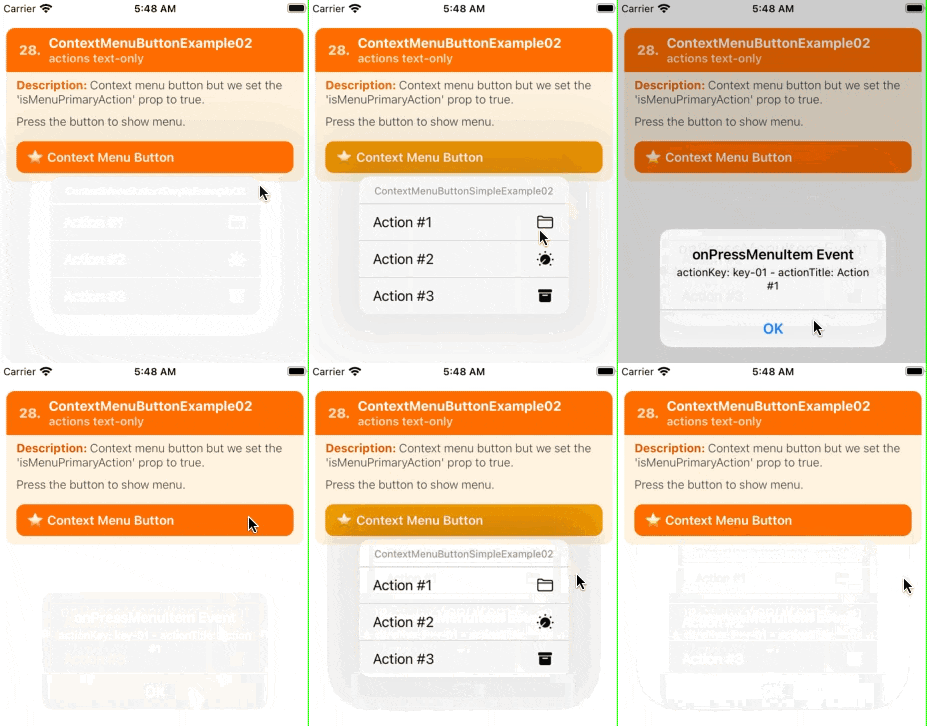
F. Showcase, Tests and Demos
G. Meta
H. Licence
MIT